Richmond Interiors
Home > Projects > Richmond Interiors

Richmond Interiors.

Richmond Interiors

Premium furniture and home-décor e-commerce for Richmond Interiors, end-to-end webshop design.

1 / 1
Date 2024
Client Contento Marketing
Category UX/UI Design
Tags UX/UI, UX Design, UX/UI Design, Webdesign, Webshop
Website · RetailLuxury e-commerceDesigned & built for Contento
Made for Contento

Luxury that still checks out in a few clicks.

Richmond Interiors is a premium furniture brand whose website had to feel as considered as its products: editorial, tactile and clearly high-end, while staying an effortless webshop from the first room shot to the confirmed order. We led the UX/UI and built it, for the agency Contento.

Role
Lead UX/UI + buildIA to UI to production
Platform
Web · E-commerceCatalogue to checkout
Studio
G2F Designfor Contento
Status
Designed & builtProduction front-end
01

Two instincts pulling in opposite directions.

Luxury retail carries a built-in tension. The brand wants to slow you down to admire the materials, the craft and the room it belongs in. Commerce wants the opposite: to move you to purchase without friction. Premium shoppers expect both.

Get it wrong one way and a generic webshop template cheapens the brand. Get it wrong the other way and an over-art-directed site buries the “buy” button. Richmond had to hold both at once.

The site had to feel like a showroom and behave like a modern store.

What success required

  • A premium, editorial feel worthy of the product
  • A short, confident path from browsing to checkout
  • One visual system across every page
  • A route for trade and interior-design partners too
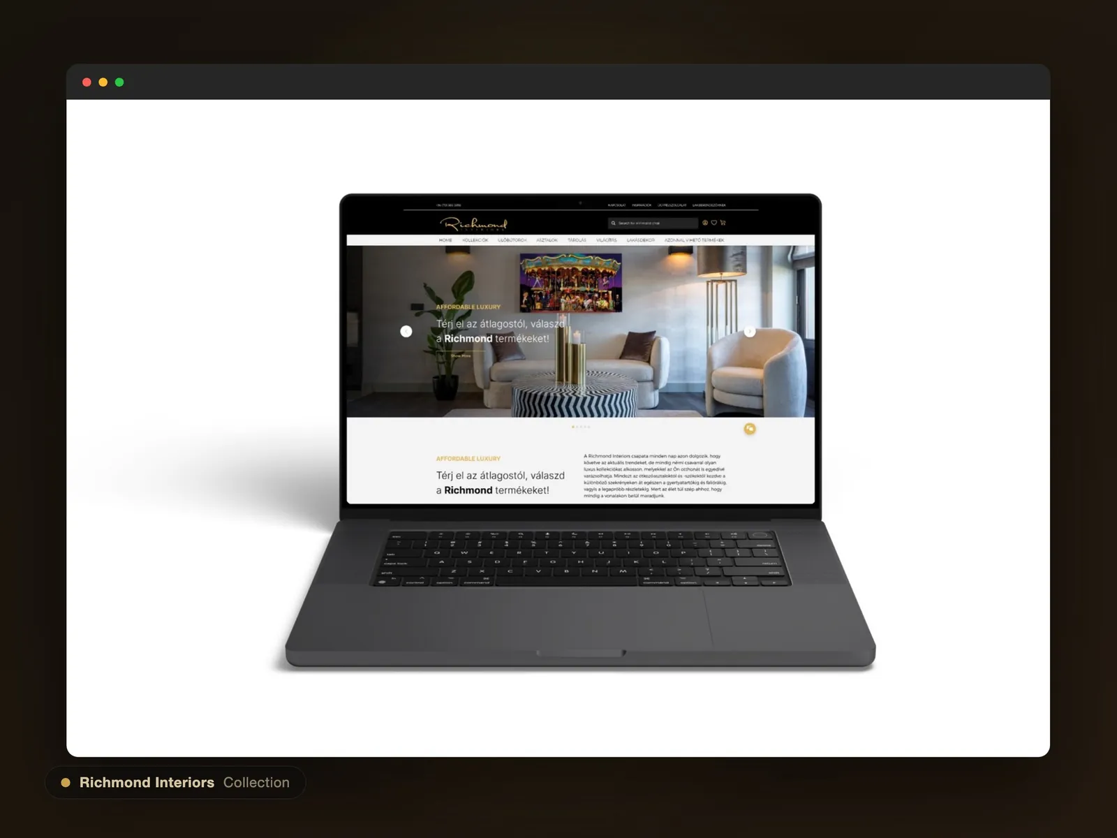
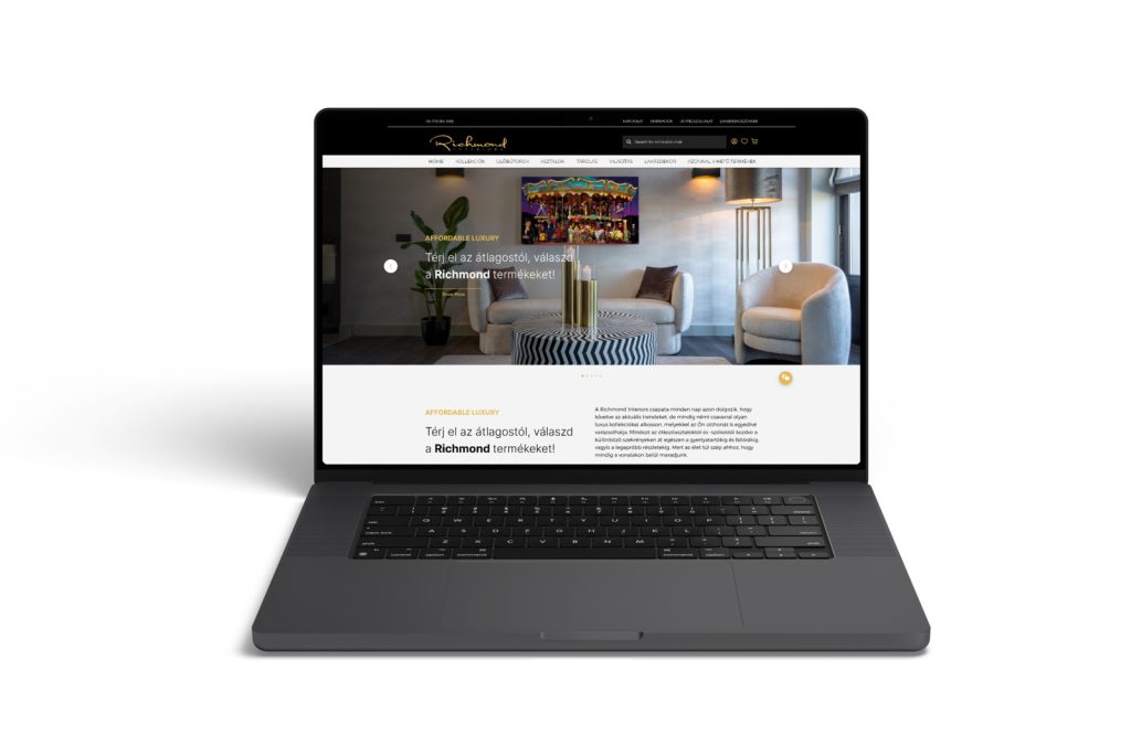
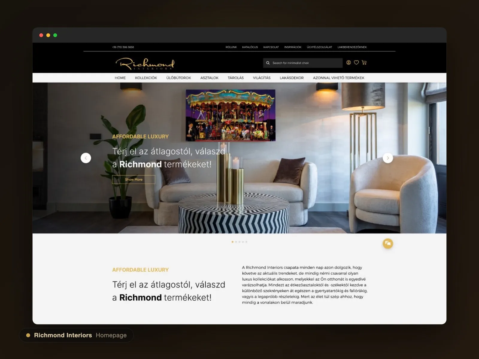
Richmond Interiors: The homepage: room context and material before a product grid, a showroom tone from the first scroll.
The homepage: room context and material before a product grid, a showroom tone from the first scroll.
02

From benchmark to built.

We owned the experience end to end for Contento: benchmarking luxury commerce, defining the information architecture, designing the UX/UI and visual language, and building the production front-end. Taking it to code meant the premium details survived the handoff instead of being value-engineered away.

What we owned

  • Competitive benchmarking of luxury e-commerce
  • Information architecture and navigation
  • Catalogue, product, cart and checkout UX
  • The editorial visual system and design language
  • The production front-end build

Context & constraints

  • A luxury furniture brand: the feel is non-negotiable
  • Delivered for the agency Contento
  • Consumer and trade audiences on one site
  • Premium imagery that had to stay fast and responsive
03

Four decisions that kept both sides happy.

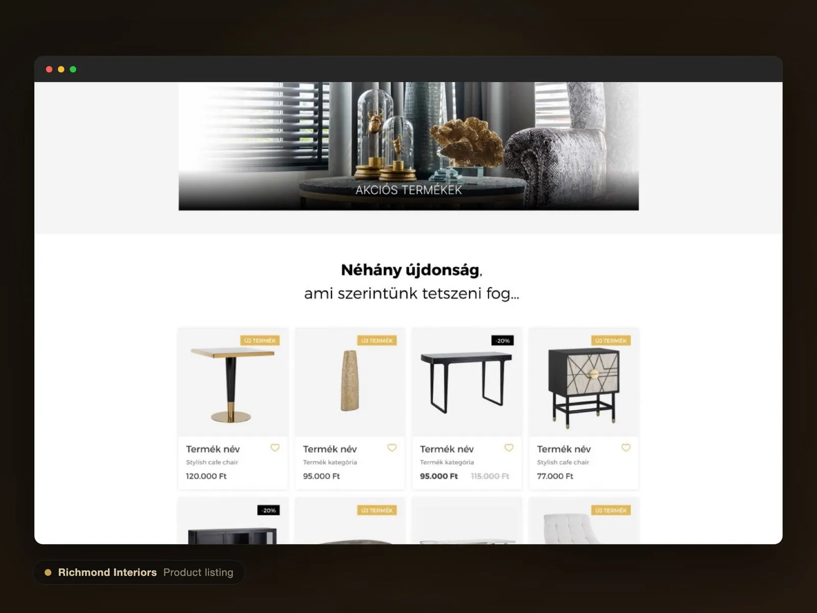
1

Editorial storytelling over a product grid

A dense grid reads as “catalogue”; luxury reads as “collection”.

Options considered

A classic dense product grid, or editorial, room-in-context storytelling.

The choice

Large imagery, rooms in context, and collections presented as stories.

Trade-off accepted

Fewer products per view and more scrolling, in exchange for desirability and time on site.
2

Keep the purchase path short under the richness

The look can be unusual; buying must not be.

Options considered

Experimental commerce UI, or familiar, trusted patterns.

The choice

Conventional, legible product, cart and checkout patterns under the editorial surface.

Trade-off accepted

Restraint on novelty at the point of sale, so the premium feel never costs usability.

3

One tactile design system for the whole house

Luxury falls apart the moment two pages feel like different brands.

Options considered

Page-by-page art direction, or a shared tactile design system.

The choice

A warm, material-led system: refined type, generous whitespace, the same components everywhere.

Trade-off accepted

Discipline up front, in return for a site that feels like one considered place.

4

A dedicated path for trade partners

Interior designers and resellers buy differently from consumers.

Options considered

One generic journey for everyone, or a separate partner route.

The choice

A clear partner and trade path alongside the consumer experience.

Trade-off accepted

More IA to maintain, in exchange for serving a high-value audience properly.

Richmond Interiors: Catalogue: curated, airy, materials first.
Catalogue: curated, airy, materials first.
Richmond Interiors: Collections presented as stories, not a spec grid.
Collections presented as stories, not a spec grid.
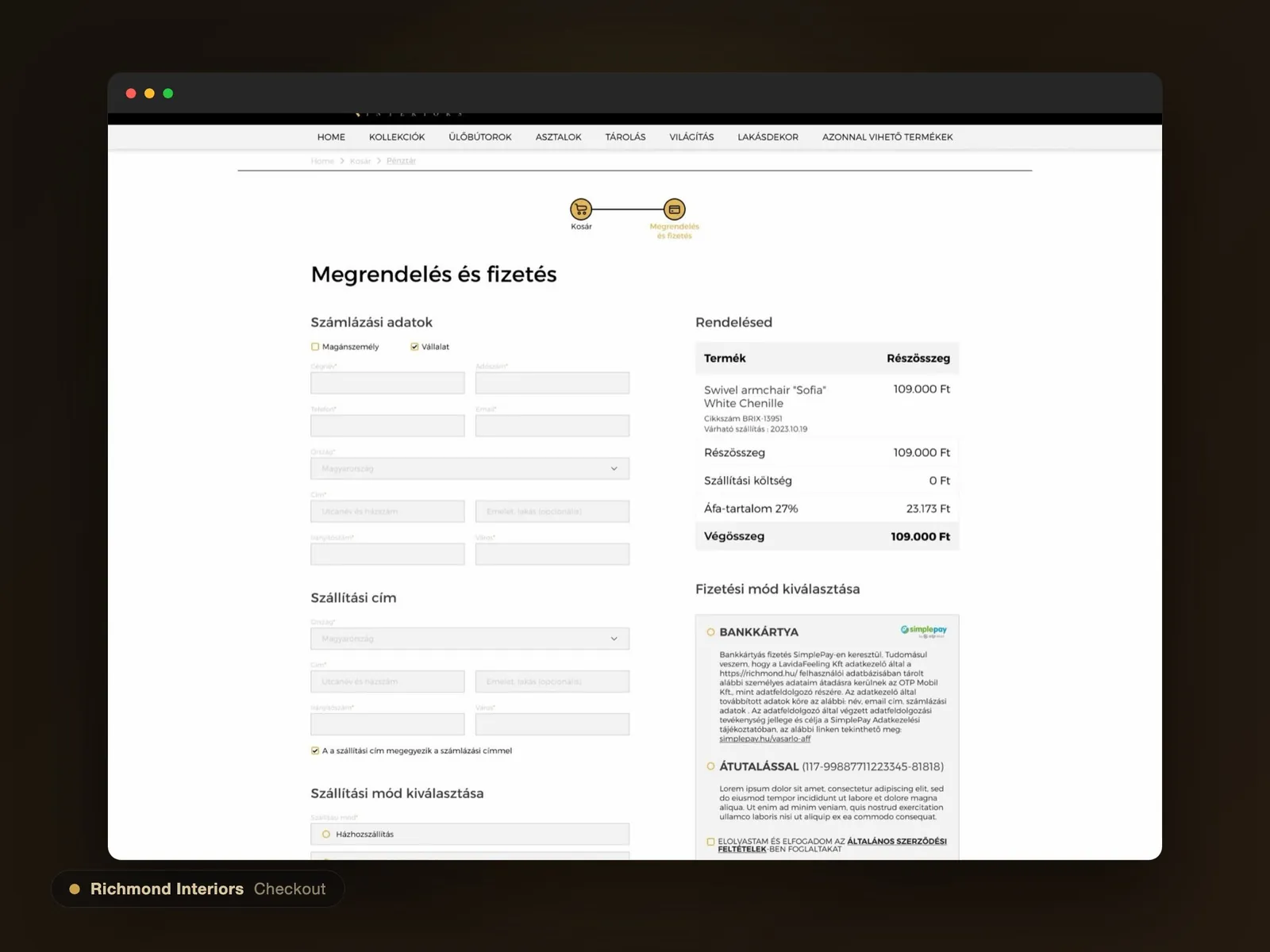
Richmond Interiors: Checkout: familiar and fast, so the luxury never gets in the way.
Checkout: familiar and fast, so the luxury never gets in the way.
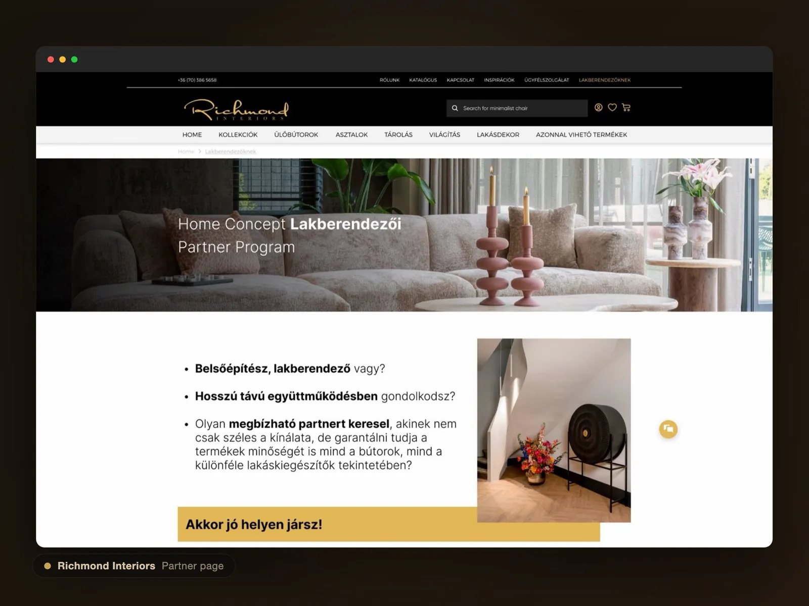
Richmond Interiors: A dedicated route for interior-design and trade partners.
A dedicated route for interior-design and trade partners.
04

A showroom that sells.

End to endBenchmarked, designed and built as a production front-end
1 systemOne tactile design language from home to checkout
2 audiencesConsumers and trade partners served on one site

Richmond shipped as a cohesive luxury webshop where the brand feel and the path to purchase finally pull the same way. It was a client build, so the evidence is the craft and consistency of the shipped experience and a checkout kept deliberately effortless.

See it in action

The site is live. Take a look for yourself.

Have a similar challenge? Let's talk.

Book a 30-minute call

Companies we have worked with.

Since 2004, across healthcare, telecom, e-commerce, retail and industry.

VodafonedmMacmillanLa MarzoccoRichmondMedtrendALTEOASIC MinerzContentoÉges HelyettHomeMedIpari MarketingLogi StoreMagyarok a VilágScanomedShopper ParkVodafonedmMacmillanLa MarzoccoRichmondMedtrendALTEOASIC MinerzContentoÉges HelyettHomeMedIpari MarketingLogi StoreMagyarok a VilágScanomedShopper Park

Have a product that should be easier to use?

Tell us what you are working on. We reply within one working day, and the first call is free and without obligation.

TOP 3% TALENT

Vetted byHire me