MEDTREND
Home > Projects > MEDTREND

MEDTREND.

MEDTREND

A diabetes-care platform rebuilt around its patient portal: webshop, portal and knowledge base in one clear system.

1 / 1
Date 2026
Client Contento Marketing
Category Health-tech platform
Tags UX/UI, Patient portal, Webshop, Health
Web · Health-techPatient portal + webshopUX/UI for Contento
Made for Contento

One site doing three jobs, rebuilt into one clear system.

MEDTREND is a Hungarian diabetes-care platform for Di-Care Zrt.: part patient portal, part webshop, part knowledge base. Working for the agency Contento, we rebuilt a sprawling site that was losing its paid traffic into one confident system, across 22 desktop screens and a full mobile set, ready for the client’s developers to build.

Role
Lead UX/UI DesignerIA to UX to UI to build-ready
Platform
Web · Responsive22 desktop + full mobile
Client
MEDTREND · Di-Care Zrt.for Contento
Year
2026Custom development from our design
01

Too many doors, no clear path.

The same site has to sell blood-glucose meters and a 7-in-1 home minilab, host a private portal where people store and read their own measurements, and teach newcomers how to live with diabetes. It had grown into all three at once, and the seams were showing.

Traffic was climbing, but the money spent driving it was leaking away. Paid campaigns dropped people onto a structure that couldn’t tell them where to go, and they left before they bought, registered or found an answer.

The fix wasn’t new content. It was telling each visitor, in the first second, which of the three things this is for them.

What was broken

  • Paid traffic arrived with intent and left without acting
  • The patient portal, the main reason to return, was buried
  • Shop, portal and learning blurred into one flat menu
  • No layout that worked on the phone people check readings on
medtrend.hu
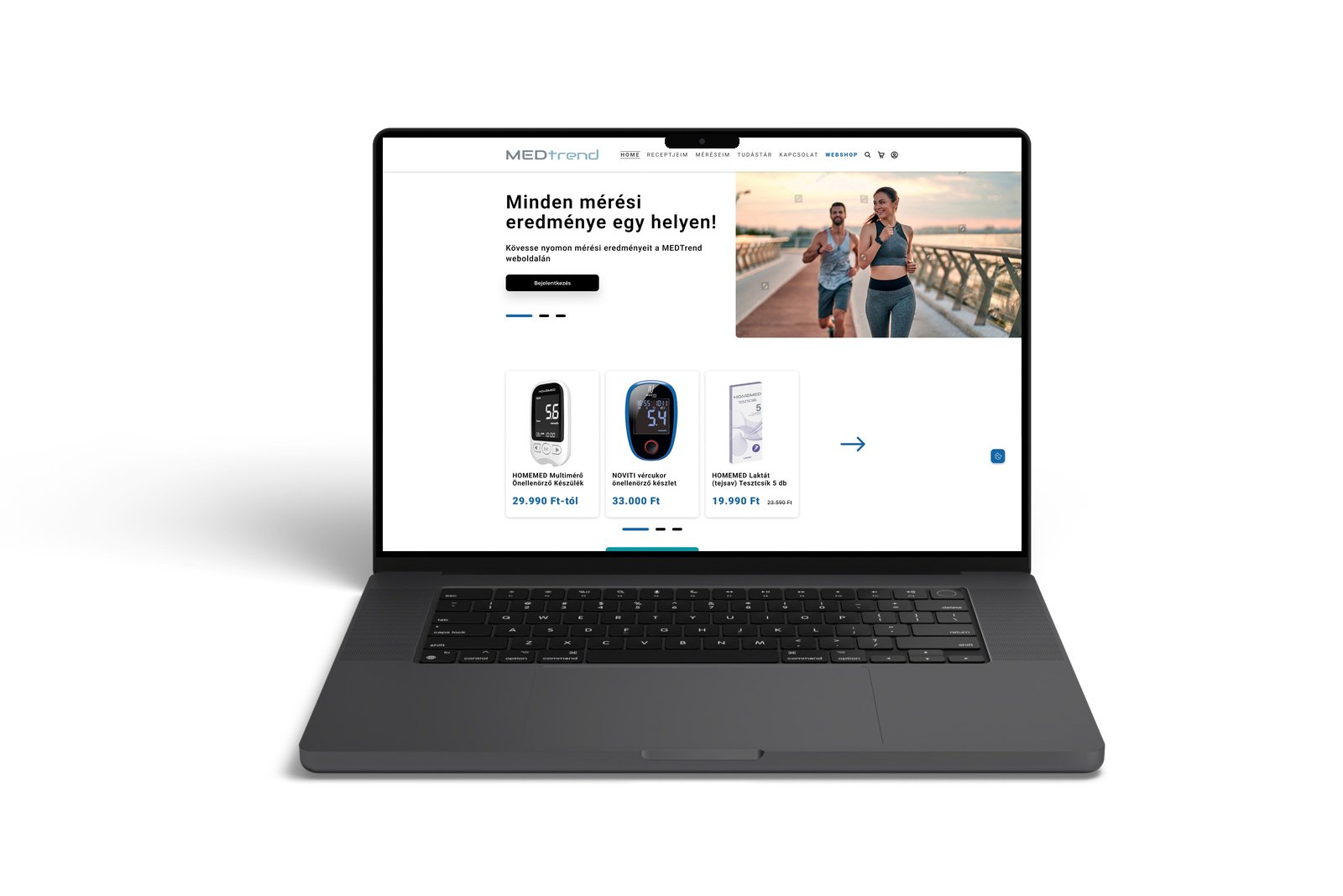
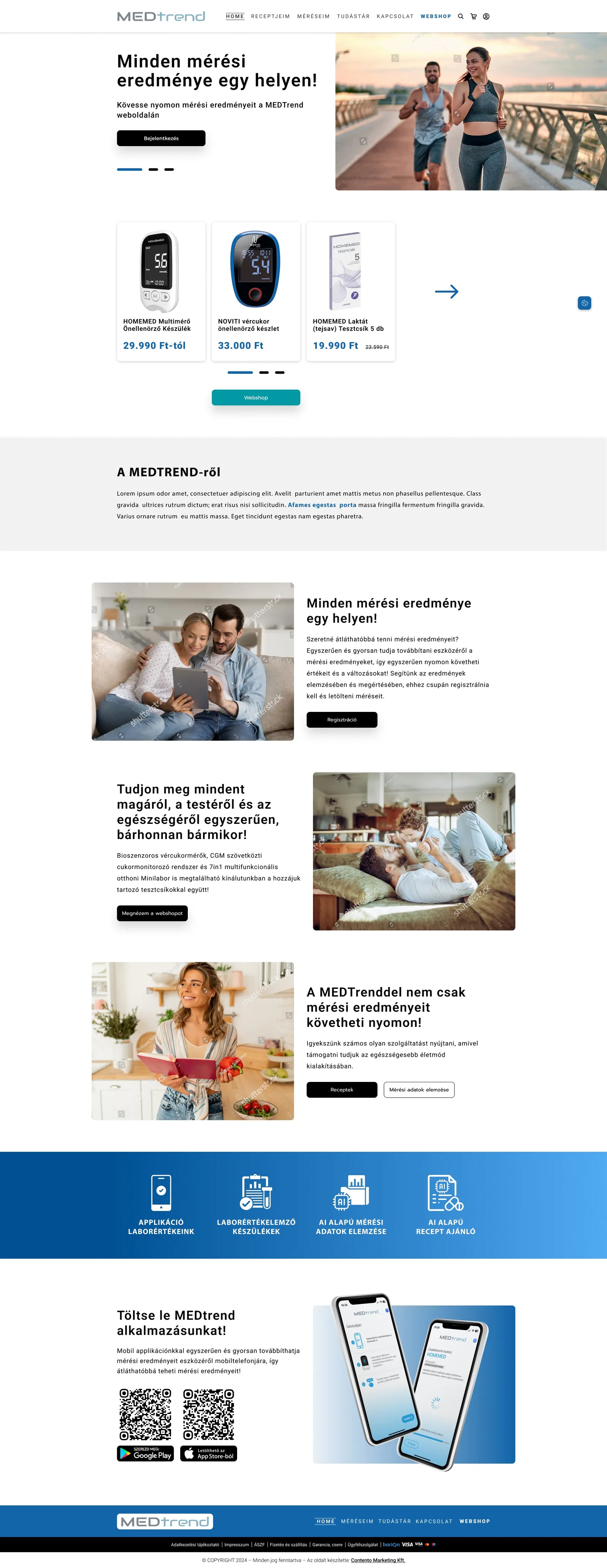
MEDTREND: The new homepage routes three audiences, shop, portal and education, from the first screen. Scroll inside the frame.
The new homepage routes three audiences, shop, portal and education, from the first screen. Scroll inside the frame.
02

A full redesign, not a reskin.

We reworked the information architecture so each audience has an obvious path, gave the patient portal the status of a first-class product, and delivered a complete, build-ready set of screens the client’s developers could implement directly.

What we owned

  • UX research and audit
  • Information architecture and user flows
  • Interaction, UI and visual design
  • The design system
  • Responsive and mobile layouts
  • Developer handoff

Context

  • Delivered for the agency Contento
  • Client: Di-Care Zrt., a Hungarian medical-device company
  • Products: NOVITI meters, CGM, HOMEMED minilab, test strips
  • Audience across generations, from 30 to 70+
  • Built by the client’s developers from our design
03

Four decisions that gave every visitor a path.

1

Split the navigation by intent

People come to do two things: buy a device or open their measurements.

Options considered

Keep one flat menu for everything, or elevate the two main jobs.

The choice

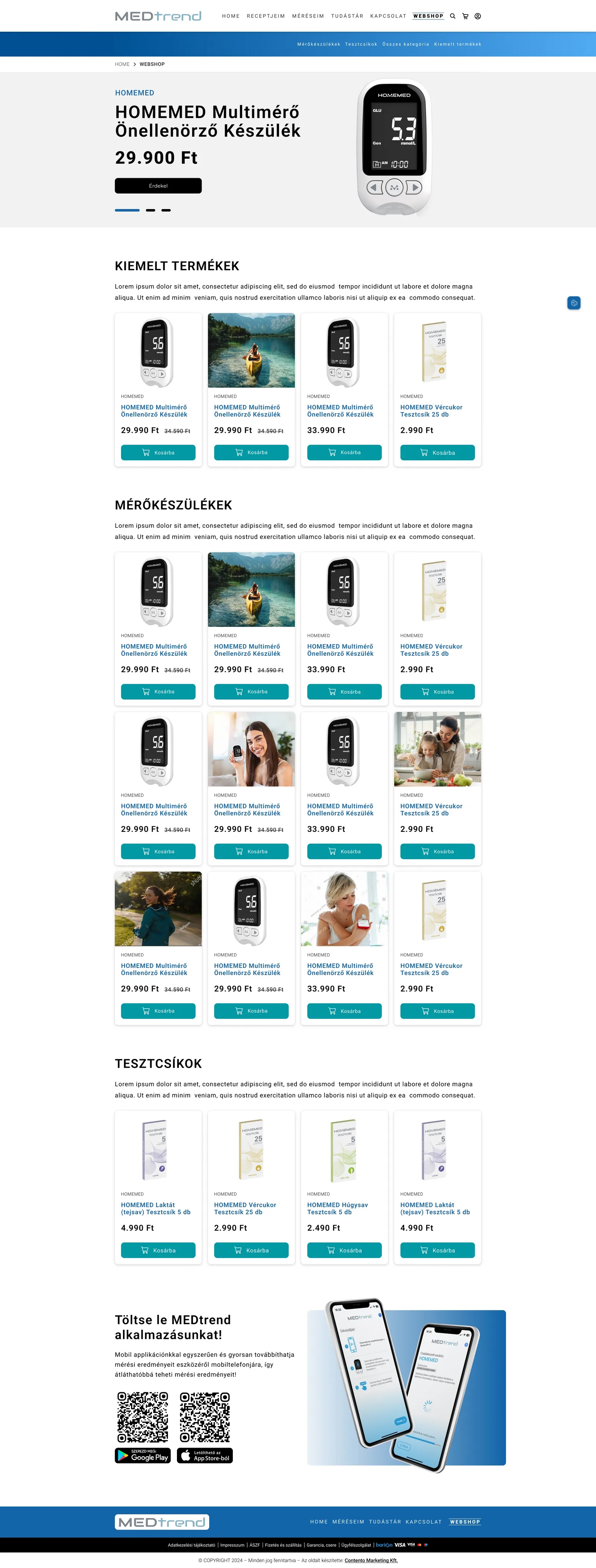
Webshop and Méréseim (my measurements) called out on their own, with everything else in four clear areas: shop, patient portal, education, support.

Trade-off accepted

Some secondary pages move one level down, in exchange for an obvious first click.
2

Promote the patient portal to the centre

Storing and understanding your own readings is the reason to come back.

Options considered

Leave the portal as one feature among many, or make it the product’s centre of gravity.

The choice

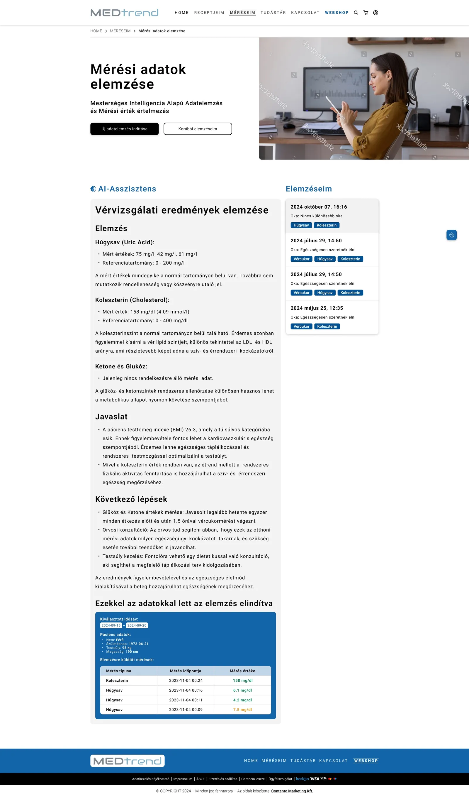
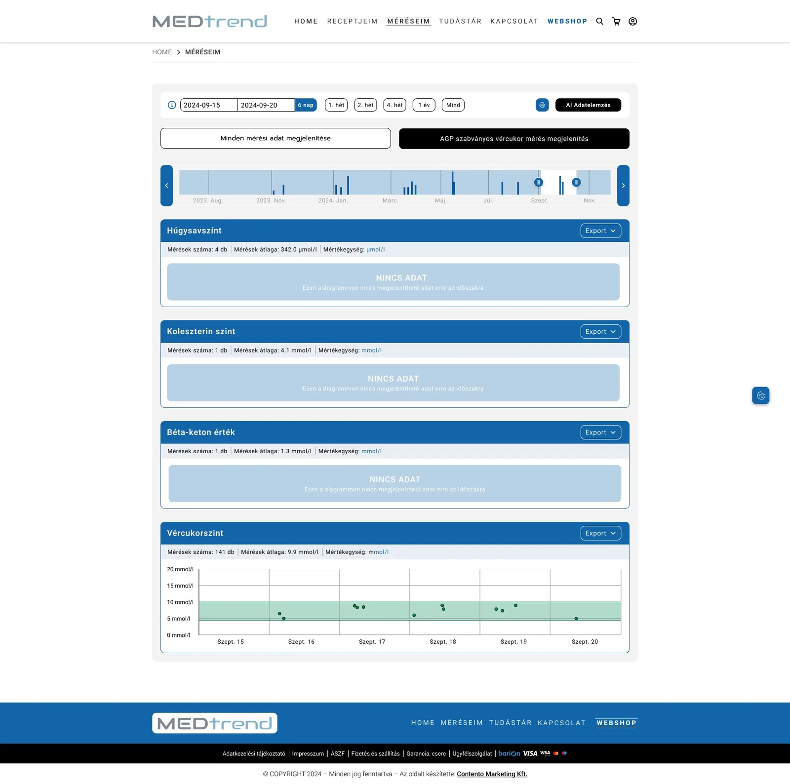
A calm measurement dashboard plus an AI-assisted analysis that explains glucose, ketone, cholesterol and other trends in plain language.

Trade-off accepted

More design depth in the logged-in area, for the loop that brings people back.

3

Clinical trust, without the cold

Medical data has to feel trustworthy, but a daily companion shouldn’t feel like a hospital form.

Options considered

Classic clinical white and blue, or a warmer, more legible system.

The choice

Medical blue for structure, a fresher teal for every primary action, calm white cards and large type for every age.

Trade-off accepted

A stricter colour rule (teal only for actions), so the next step is never in doubt.

4

One action, everywhere

The buyer and the patient are often the same person.

Options considered

Separate styles for shop and portal, or one shared language.

The choice

Add to cart, continue and pay always use the same teal button in the same place, in the same card language as the portal.

Trade-off accepted

Less visual variety, in exchange for a platform that feels like one product.

medtrend.hu/meresim
MEDTREND: Méréseim: a calm overview of what the device recorded.
Méréseim: a calm overview of what the device recorded.
medtrend.hu/elemzes
MEDTREND: Data analysis: trends over time with a plain-language read-out.
Data analysis: trends over time with a plain-language read-out.
medtrend.hu/webshop
MEDTREND: Webshop: meters, CGM, the HOMEMED minilab and test strips.
Webshop: meters, CGM, the HOMEMED minilab and test strips.
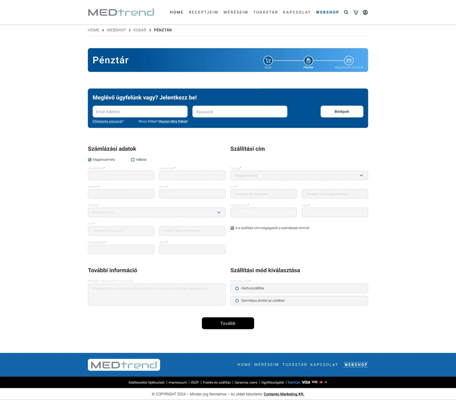
medtrend.hu/penztar
MEDTREND: Checkout: billing, delivery and payment in one calm column.
Checkout: billing, delivery and payment in one calm column.
04

Structure that converts.

22Desktop screens, plus a full mobile set
3 → 1Audiences in one system: shop, portal, education
4Clear areas instead of a flat, blurred menu
100%Build-ready, handed to custom development

Paid traffic now lands with an obvious next step: buy, register or learn. The measurement portal and its analysis moved from a buried feature to the reason to return, and every page was delivered in desktop and mobile layouts as one system the developers could build without guesswork.

Want every detail?

The full case study has the research, flows and every screen.

Have a similar challenge? Let's talk.

Book a 30-minute call

Companies we have worked with.

Since 2004, across healthcare, telecom, e-commerce, retail and industry.

VodafonedmMacmillanLa MarzoccoRichmondMedtrendALTEOASIC MinerzContentoÉges HelyettHomeMedIpari MarketingLogi StoreMagyarok a VilágScanomedShopper ParkVodafonedmMacmillanLa MarzoccoRichmondMedtrendALTEOASIC MinerzContentoÉges HelyettHomeMedIpari MarketingLogi StoreMagyarok a VilágScanomedShopper Park

Have a product that should be easier to use?

Tell us what you are working on. We reply within one working day, and the first call is free and without obligation.

TOP 3% TALENT

Vetted byHire me