SzivarInfo
A closed, invite-only digital home for Hungary's premium cigar community — a catalog, virtual humidor, ratings, social feed, clubs and events reimagined from a plain web tool into a quiet, editorial members' club. Rebrand and end-to-end product design, from szivar.online to szivarinfo.hu.
The Brief and
My Mandate
SzivarInfo is a members-only social platform for Hungary's premium cigar aficionados — not a webshop and not tobacco advertising, but a private community behind a login. It runs today at szivar.online; the goal was a full brand and experience refresh before it moves to its own home at szivarinfo.hu. I owned the work end to end: identity, UX and a fully built, high-fidelity front end.
The existing product worked, but it read like a generic catalog tool — a white page with an orange accent, boxed product cards and an interface indistinguishable from any e-commerce store. For an audience that treats cigars as a slow, considered ritual, the experience felt fast, transactional and anonymous. It had none of the restraint the subject deserves.
My brief was to give the community a real identity and a real home: a name and mark, an art direction, and a complete set of redesigned, buildable screens spanning the whole product — catalog and data sheets, a virtual humidor, check-ins and a social feed, clubs, events, a lounge map and membership. The constraint throughout: this is an MVP for a cost-sensitive client, so every decision had to earn its place.
This is a design case study. The product, brand and screens are real and were built; the research figures, personas and quotes here are realistic but illustrative placeholders that stand in for the client's own discovery — swap them for verified numbers before presenting to a decision-maker.
A Refined Subject
in a Generic Skin
The community existed, but the interface undersold it — a stock e-commerce layout for a subject that is anything but stock. And the whole category is a minefield of clichés that cheapen a premium brand the moment you touch them.
Looked Like a Web Shop
White background, orange accent, bordered cards, a specs table under every product — the app read as a store checkout, not a private club for people who savour the craft.
No Identity to Belong To
There was no mark, no voice, no art direction. An invite-only community needs to feel like somewhere you were let in — and nothing on screen signalled membership or belonging.
A Category Full of Clichés
Cowboys, skulls, heavy gold, vintage kitsch, and the tired green-gold and blue-gold of local competitors. Every obvious move for "cigar" makes the brand look cheaper, not richer.
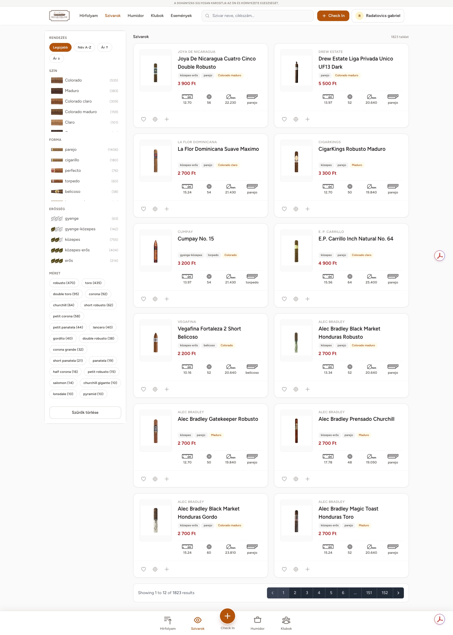
Before The live product: 1,823 cigars in a conventional white-and-orange grid. Functional and complete — but visually interchangeable with any online shop, with none of the discretion the community values.
Turn a functional catalog tool into a quiet, editorial members' club — a distinctive identity and a restrained, premium experience that treats cigar data as something to savour, and makes every member feel they belong to something private.
Learning the
Room First
Before drawing anything, I mapped the audience, the competition and the references the brief pointed to — so the redesign could borrow restraint from the best luxury houses while deliberately sidestepping everything that makes the category look cheap.
The age range
Product modules
Reference brands
UX patterns borrowed
Western & cowboy motifs, skulls, excessive gold, vintage "Est. 1840" kitsch, and the dark-green-gold / dark-blue-gold palettes already used by local lounges. Every one of these is the obvious, and the obvious is what makes premium look cheap.
Editorial whitespace, considered typography, warm neutrals and a single restrained metallic. Take the discipline of a fashion magazine and a Davidoff boutique — and let the cigars, not the chrome, carry the luxury.
“I don't want a shop. I want somewhere to keep notes and talk to people who get it.”
The product's centre of gravity is community and record-keeping, not transactions. We led with the feed, the humidor and check-ins — and stripped the storefront language entirely.
“A cigar is a two-hour thing. The app feels like it's rushing me.”
Pace became a design material. Generous whitespace, slow motion and an editorial rhythm signal that this is a place to linger, not to check out fast.
“The details matter — ring gauge, wrapper, strength. Give me the real data.”
Data is the luxury here. We elevated the spec sheet — dimensions, ring, strength, flavour profile — into a beautifully typeset object rather than a table to skim.
“It should feel like being a member, not a user.”
Invite-only had to be felt, not just enforced. A crafted identity, a VIP membership card and a private, discreet tone make belonging tangible from the login screen onward.
Three Members,
One Shared Ritual
The community spans decades of age and expertise. These three archetypes kept every decision honest — from how much data to surface, to how welcoming the newcomer's path had to be.
- Track a large humidor by humidity and age
- Keep detailed tasting notes over years
- Discover rare boxes worth the shelf
- Spec data buried or too shallow
- Generic tools with no sense of craft
- No trustworthy place to compare notes
- Learn what wrapper and strength mean
- Find approachable first cigars
- Meet people without feeling out of place
- Jargon with no explanation
- Communities that feel closed and gate-kept
- Nowhere to start with confidence
- Run his club and post its events
- See who's checking in nearby
- Recommend lounges to visiting members
- No home for local clubs and meetups
- Events scattered across chat groups
- Hard to welcome and orient newcomers
One Club,
Nine Rooms
A flat, discoverable structure organises the whole community. A persistent bar keeps the everyday actions one tap away, while nine modules cluster into four clear intents — collect, connect, discover, belong.
Finding the Voice
Before the Screens
I explored three distinct art directions for the community's homepage — each a different personality, not just a different palette. The chosen route rejects the dark-lounge cliché entirely in favour of an editorial magazine language: stark obsidian meeting warm ivory.
Editorial Noir
Ivory paper and oxblood, a Fraunces serif — a light, literary magazine treatment. Elegant, but risked reading as soft and print-bound for a living community.
Members' Lounge
Espresso and clay, a Cormorant / Jost pairing — a warm, dark lounge with spotlit data cards. Handsome, but the darkness edged toward the very cliché we set out to avoid.
Editorial Magazine
Not uniformly dark. Stark obsidian chrome and hero zones meet ivory/parchment content, cut with razor-sharp horizontal edges. Restraint with contrast — the winning tension.
“The luxury had to come from restraint and contrast — not from making everything dark and gold.”
Obsidian ⇄ Ivory
The final language blocks the page into stark obsidian chrome and warm ivory content, separated by flat, razor-sharp cuts — no gradients, no drop-shadow boxes. The contrast itself is the style.
De-boxed & hairline
Every bounding box was removed. Products and cards float on ivory, separated by space and single 1px hairlines — the calm of a well-set page rather than a grid of tiles.
Watchmaker typography
Big Cormorant serifs for names and numbers; tiny, wide-tracked uppercase labels for everything functional. The type does the signalling that gold and skulls usually try to.
A Mark You're
Let Into
The identity had to say "private club" without a single cliché. After exploring monograms and heraldic crests, the final mark is a quiet, vertical monogram — a rhythm of upright strokes suggesting stacked cigars, set in warm brushed metal over obsidian, with a restrained two-weight wordmark.

An upright monogram
A circular badge of vertical strokes — cigars stood in a humidor, an "S" in negative space — legible at favicon size and dignified at full lockup. No smoke, no leaves, no coronet.
Two weights, one word
"SZIVAR" in confident caps, "INFO" in a lighter weight and warm metallic — a single word that reads as one brand, spaced wide enough to feel unhurried.
Brushed metal, not gold
A warm bronze-to-brass gradient replaces flat gold — closer to a lighter or a pen than to costume jewellery. Premium by material, not by shine.
Five Rules That
Kept It Honest
Whenever a decision got hard, these five principles — drawn straight from the brief and the research — made the call, and kept the product on the right side of the line between premium and cliché.
Restraint over cliché
When in doubt, remove. No motif that "reads cigar" earns its place unless it survives the test of looking expensive rather than obvious.
Editorial, not e-commerce
Lay the product out like a magazine, not a store. Whitespace, hairlines and typography replace tiles, borders and buy-buttons.
Data is the luxury
The specs are the jewellery. Typeset ring gauge, strength and flavour with the care a boutique gives a display case.
Mobile-first, always on hand
A cigar is enjoyed away from a desk. Every module is built to feel native on a phone, with a real bottom-nav app shell.
Make belonging felt
Invite-only should be an atmosphere, not just a gate. Identity, tone and membership make members feel welcomed in.
A Language,
Not a Skin
Nine modules and 30-plus screens only hold together because they share one vocabulary: two surfaces, one serif and one sans, a hairline instead of a box, and a small kit of tobacco-literate icons. Everything downstream is assembled from these parts — which is what let the whole product stay coherent while it grew.
Two surfaces do the heavy lifting — obsidian and ivory — with a single warm metallic as the only accent. No second colour, no gradient fills. Restraint is enforced by the palette itself.
A serif for names and numbers, a sans for functional labels. The pairing is the whole "watchmaker" idea — expressive where it's about the cigar, quiet and precise everywhere else.
Hairlines, not boxes
The system's rule: separate with space and a single 1px line, never a border-box or a card shadow. It's what gives dense catalog and spec screens the calm of a printed page.
An 8-point rhythm
Every gap and pad is a multiple of eight, and the wide-tracked labels sit on a consistent baseline — so 30+ screens share one vertical rhythm the eye reads as deliberate.
Tobacco-literate icons
A small, custom set — leaf strength meters, ring-gauge and length marks, wrapper swatches, a humidor glyph — so the data has a visual language of its own instead of generic UI icons.
One Language,
Every Room
The same obsidian-and-ivory system, carried across the whole community — from the catalog and data sheets to clubs, events, the lounge map and the knowledge base. A first look before the deep dives.
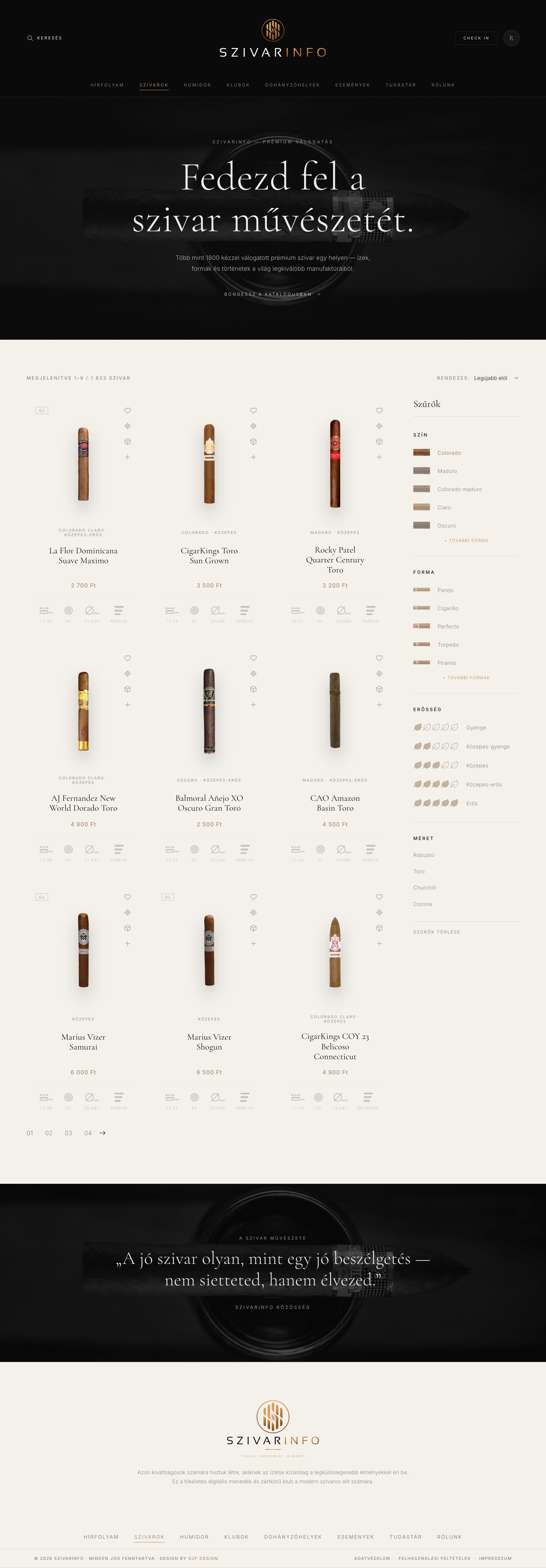
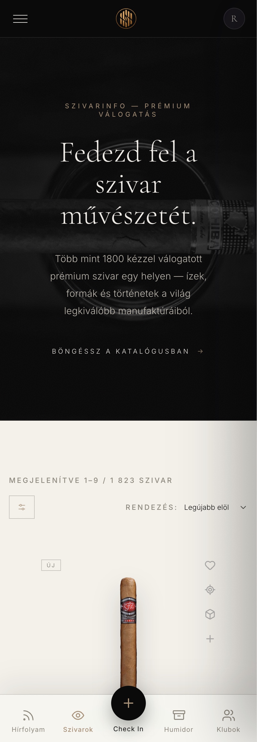
The Catalog A cinematic obsidian hero gives way to an ivory field of de-boxed cigars — the front door to 1,823 products.
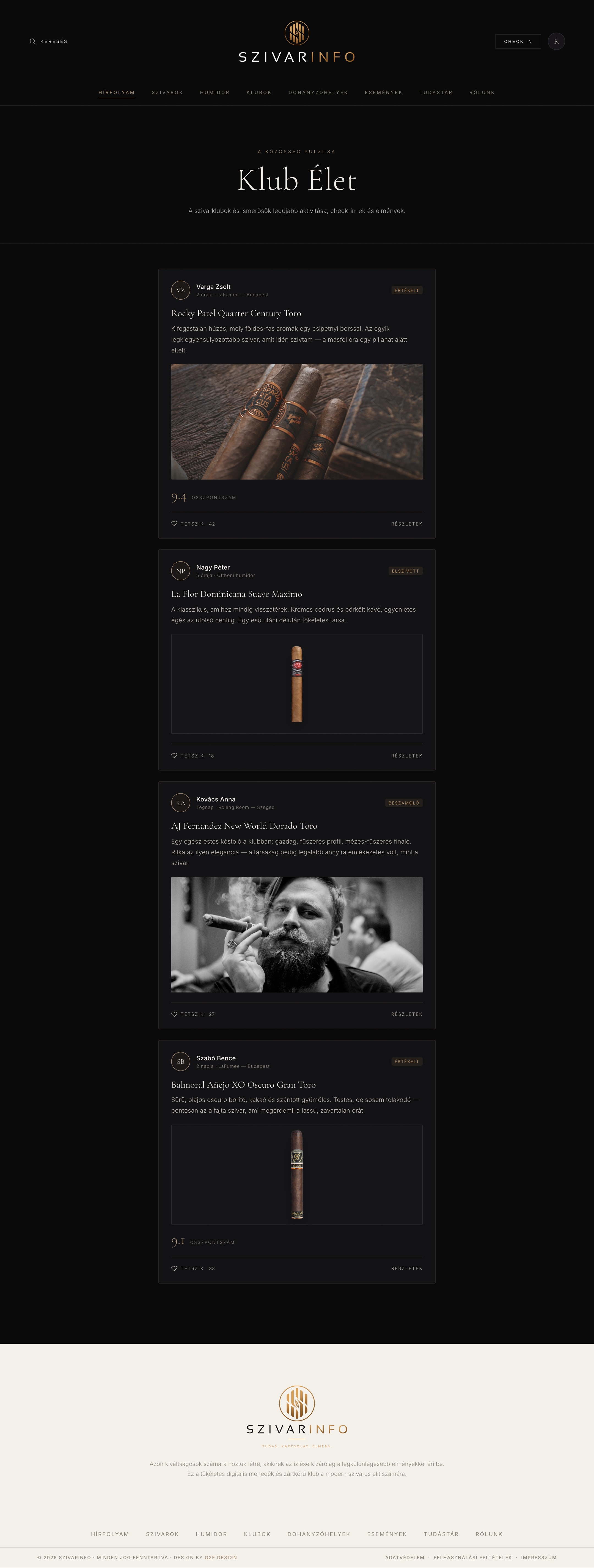
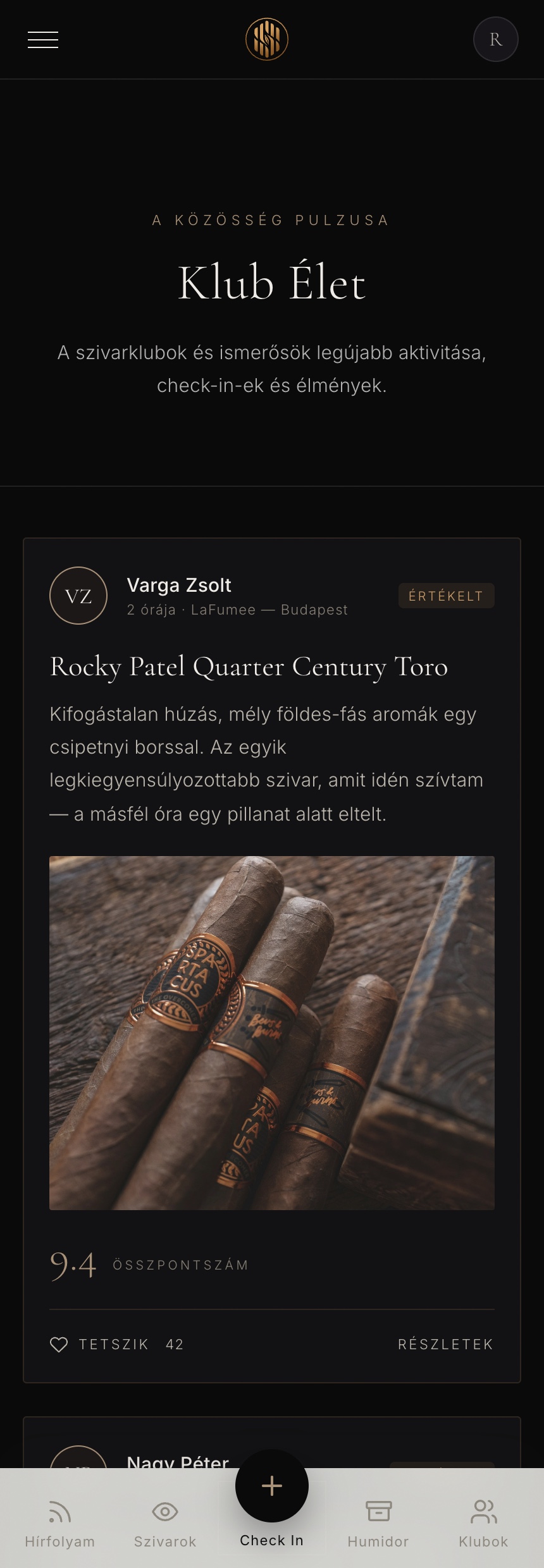
The Feed A calm, editorial timeline of check-ins, notes and club activity — the community's front page.
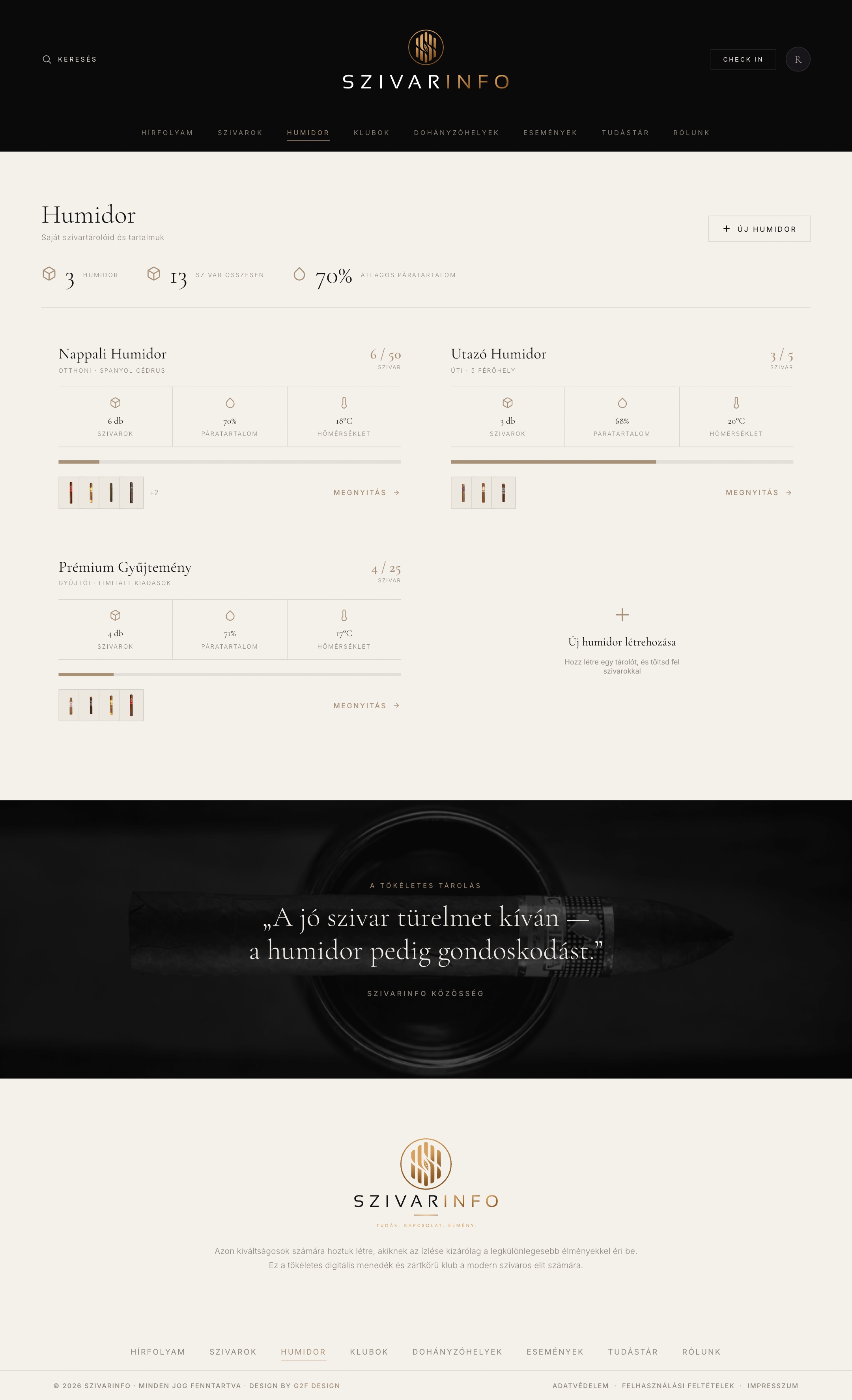
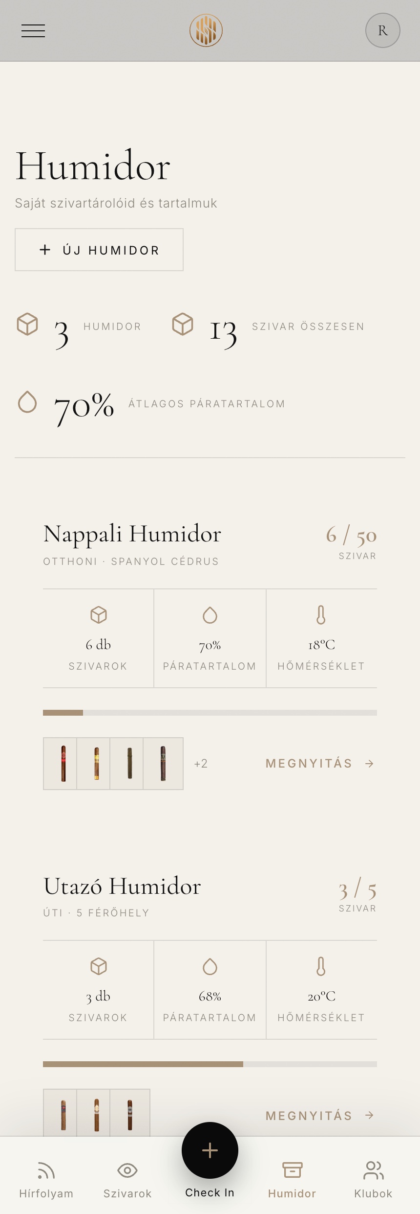
The Humidor Your collection, tracked by capacity, humidity and temperature.
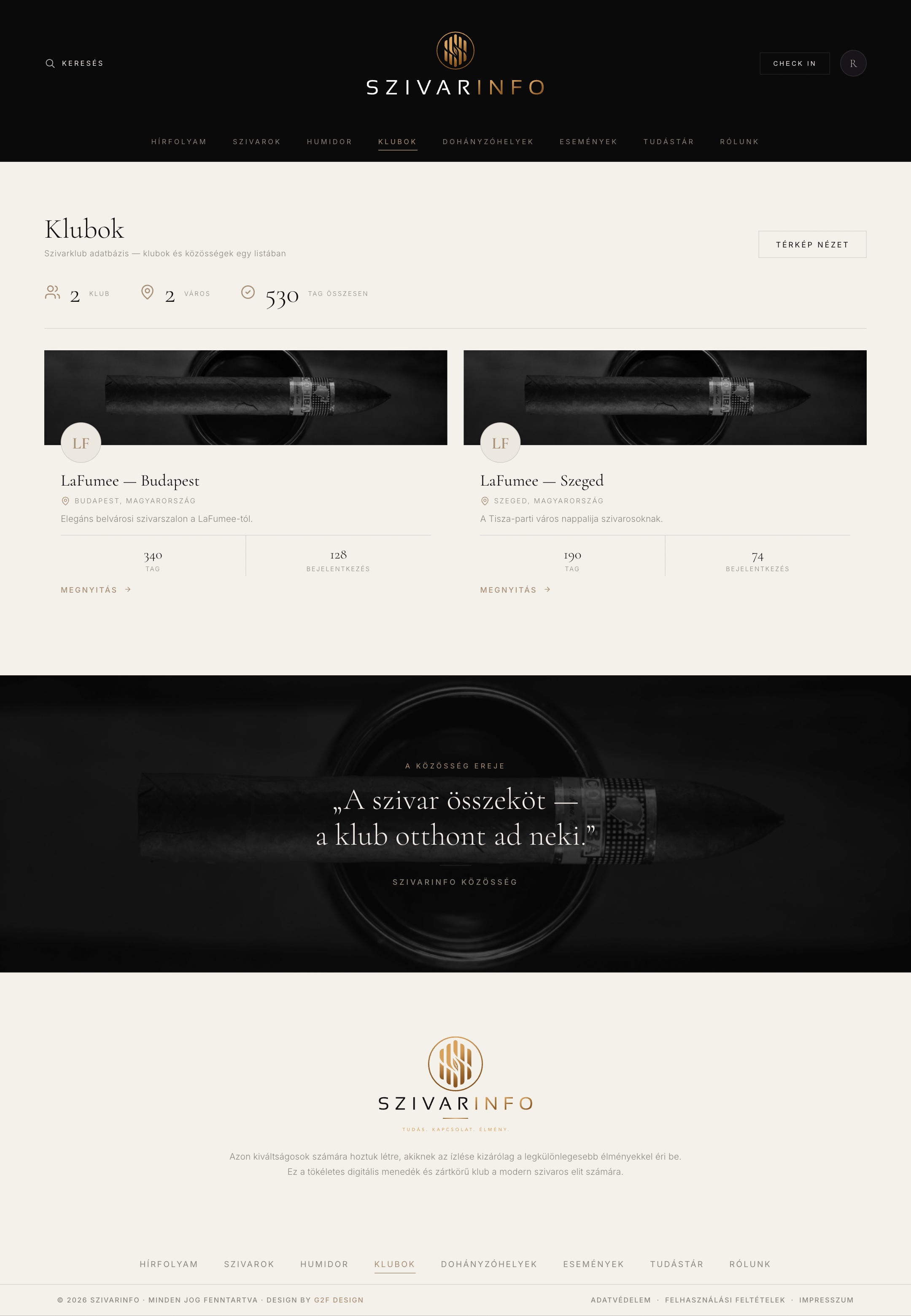
Clubs Member circles with Ken-Burns cover imagery and quiet, overhanging crests.
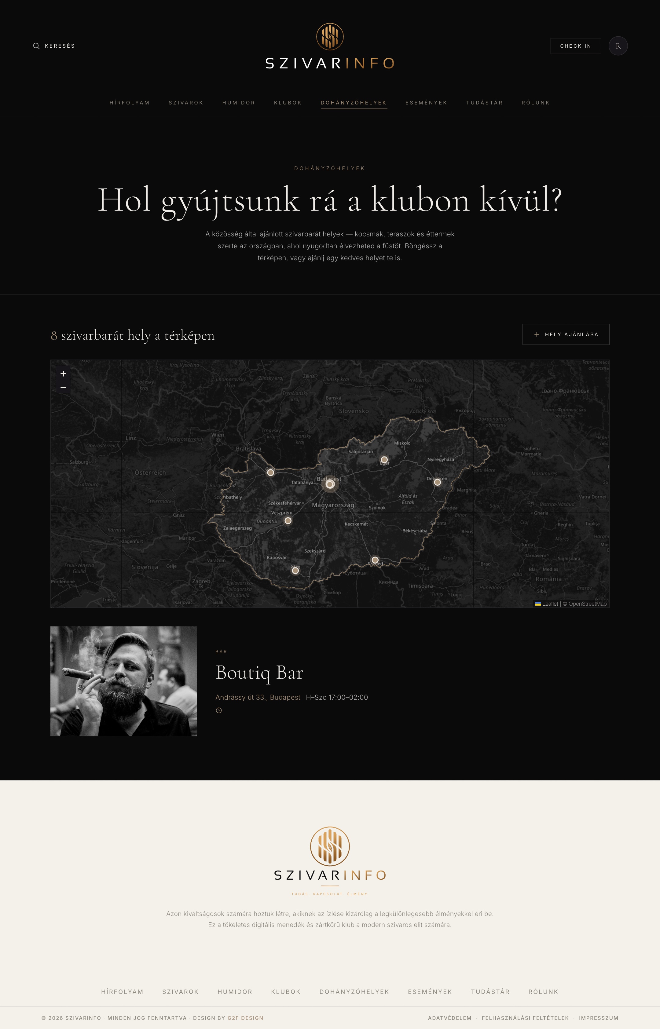
Lounge Map Where to smoke — a curated map of lounges and terraces across Hungary.
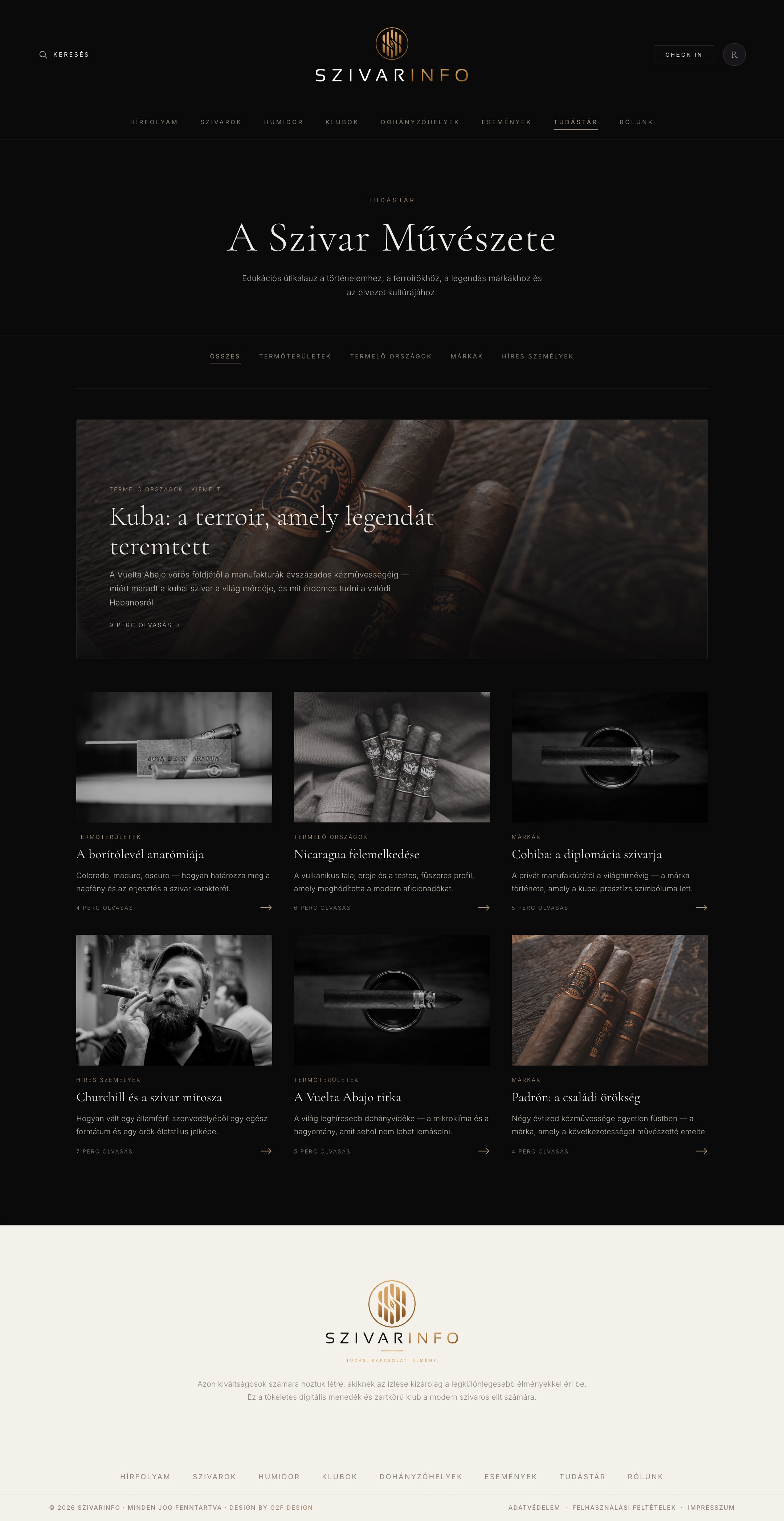
Knowledge Base The Tudástár — editorial guides that welcome newcomers without talking down.
1,823 Cigars,
Room to Breathe
The catalog is the product's spine. The redesign keeps every one of its 1,823 cigars and its deep filtering, but trades the boxed grid for floating, de-boxed cards — and moves filtering into a progressive-disclosure drawer that stays a persistent sidebar on desktop.
Bordered cards, an always-open filter wall, a specs table under each product — dense and shop-like.
The same data, de-boxed onto ivory. Cards float, specs reveal on hover, filters tuck into a calm sidebar.
Colour and shape filters cap at five options with a quiet "more" toggle, so the sidebar never becomes a wall. On mobile the same filters become a glassmorphic slide-out drawer with a scroll-locked body.
Each card shows its image, name and price at rest; the full spec row fades up on hover without shifting the grid — detail on demand, calm by default.
The Spec Sheet
as an Object
For a collector, the product page is the whole point. It had to hold serious data — dimensions, ring gauge, strength, wrapper, a manufacturer flavour profile, community ratings — and make all of it feel like something to study rather than a form to scan.
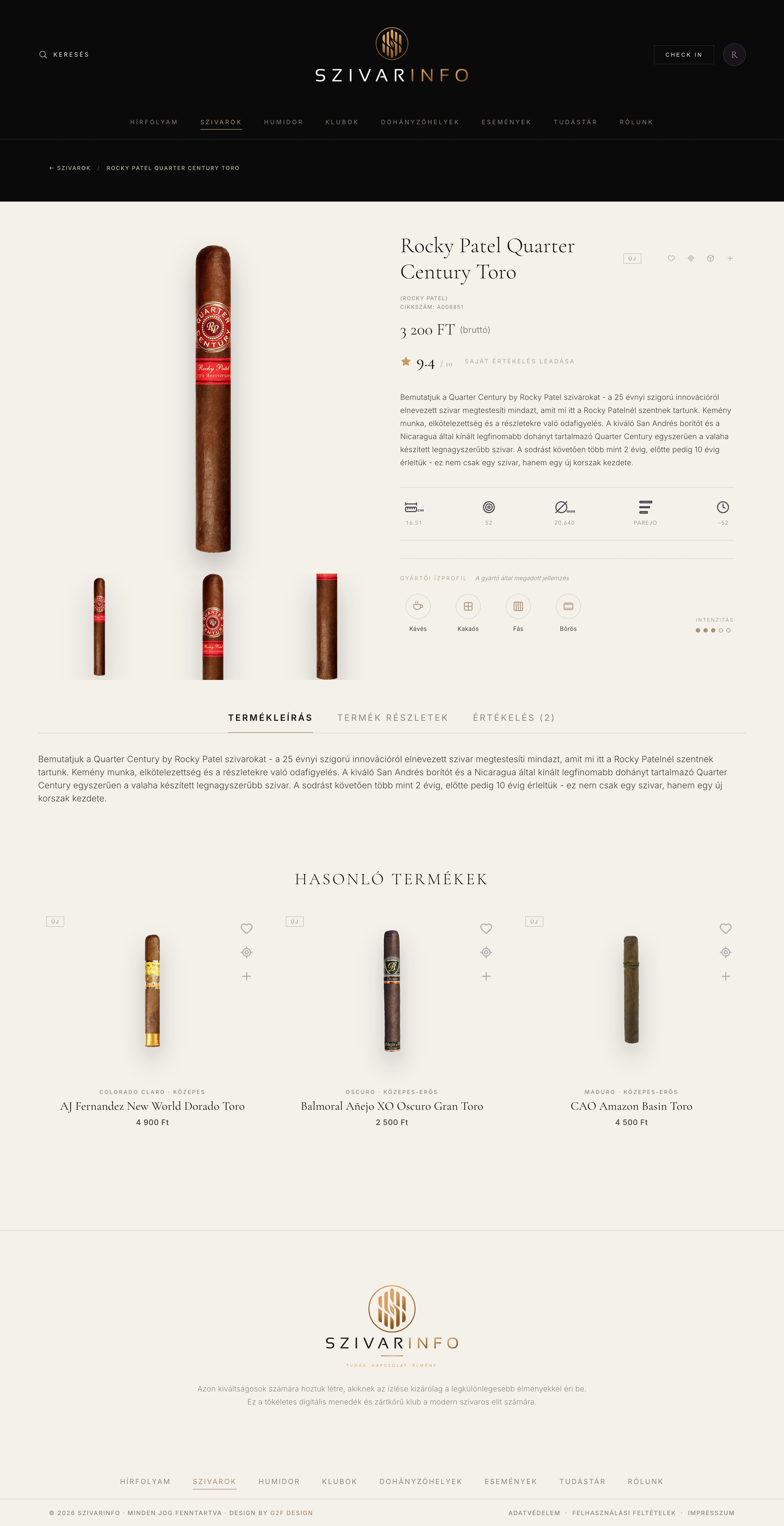
The Data Sheet A single hero cigar with alternate views, a serif name and price, a community rating out of ten, the full spec row, and a typeset flavour profile with an intensity meter — then description tabs and a hand-picked "similar cigars" rail.
Every spec, one glance
Length, ring, diameter, vitola and smoke time sit in a single hairline-separated row — the numbers set large in the serif, their labels tiny and tracked beneath.
Flavour as a profile
The manufacturer's tasting notes — coffee, cocoa, wood, leather — become icon chips with a five-dot intensity meter, so taste reads at a glance without a paragraph.
Ratings, not reviews-first
A prominent community score invites the member to add their own, foregrounding the taste graph the community is really built on.
Your Collection,
Kept Properly
The humidor is where casual users become members. It turns a shoebox of cigars into a tracked collection — multiple humidors, live capacity, humidity and temperature, and a tap into any cigar's full data sheet.
Every humidor summarised — count, humidity, temperature and fill — with big serif figures over tiny labels.
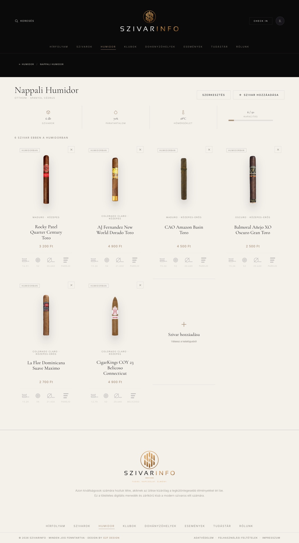
Inside a single humidor: its cigars, capacity bar and conditions, each tappable through to its sheet.
Humidity and temperature are first-class data, shown per humidor with a fill bar — the numbers a collector actually checks, surfaced without a click.
Home, travel, ageing — members keep several. Each is a card with its own type, capacity and cédar lining noted, so the metaphor stays true to the real thing.
Circles and
Gatherings
Beyond the individual, the platform organises the community into clubs and the calendar of tastings, dinners and terrace evenings that bring them together in person.
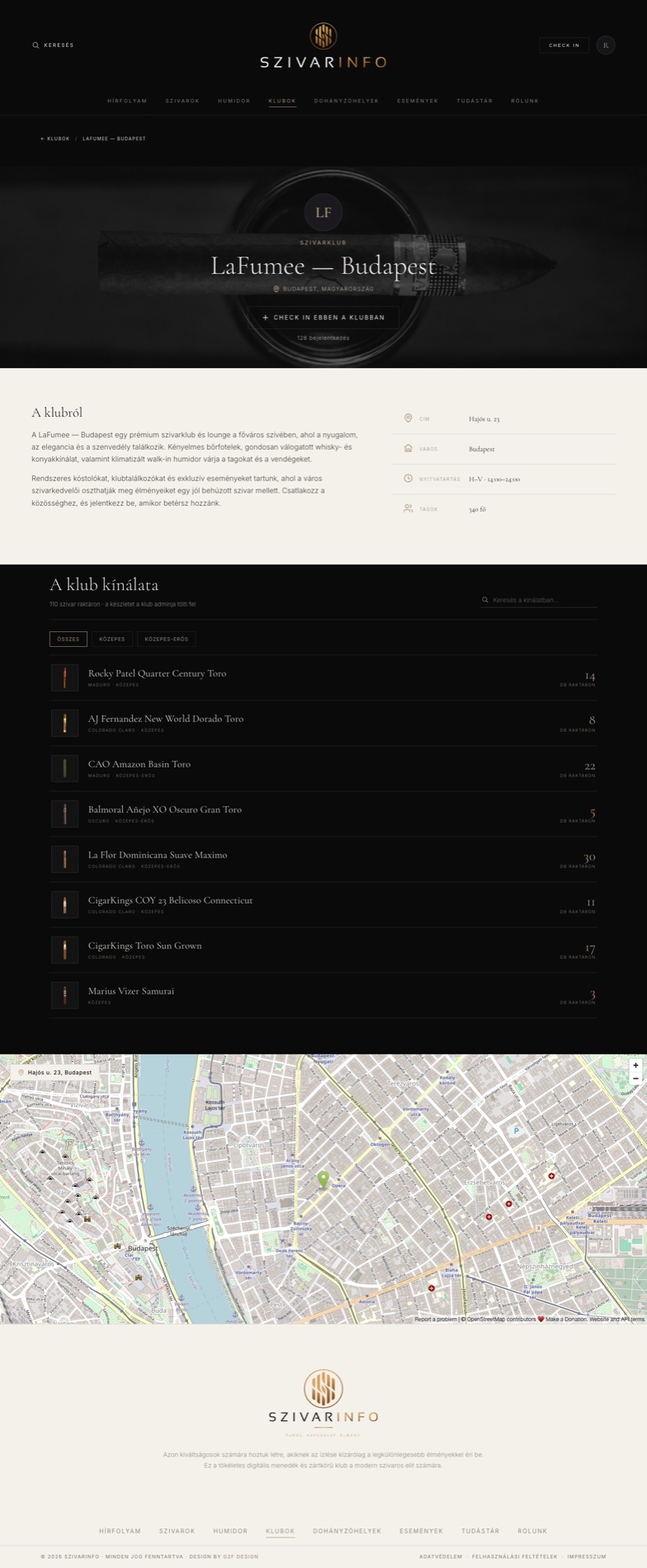
A club's home — members, inventory and check-ins, with a cinematic cover and an overhanging crest.
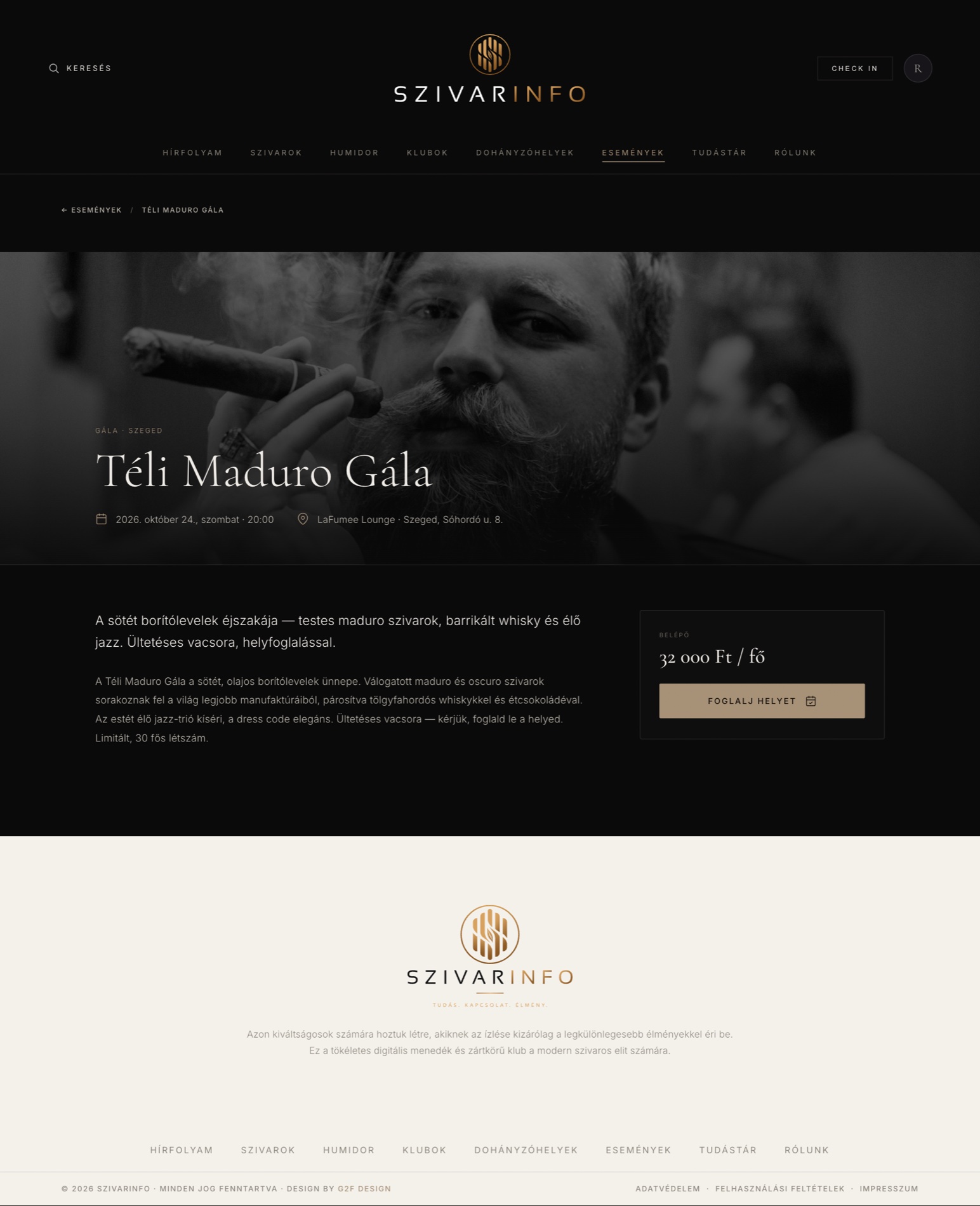
A single evening, laid out like an invitation: place, time, host and who's attending.
Where to Smoke,
What to Learn
Two modules widen the community beyond the screen: a curated map of lounges and terraces where members can actually meet, and a knowledge base that turns the newcomer's confusion into a warm on-ramp.
A hand-curated map of Hungarian lounges — restrained, branded, and free of stock map clutter.
The Tudástár — editorial primers on wrappers, strength and ritual, written to welcome, not gate-keep.
Made to Feel
Like a Member
Invite-only is the whole premise, so the profile makes belonging tangible — a personal spec-sheet identity, a VIP membership card with its own QR, favourites and balance — and it starts at a split-screen login that feels like a boutique door, not a form.
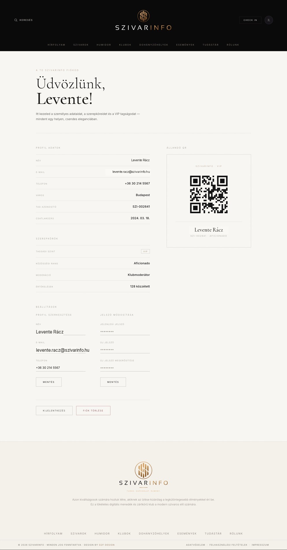
A member's identity as a typeset spec-sheet, with a minimalist VIP card and a generated QR.
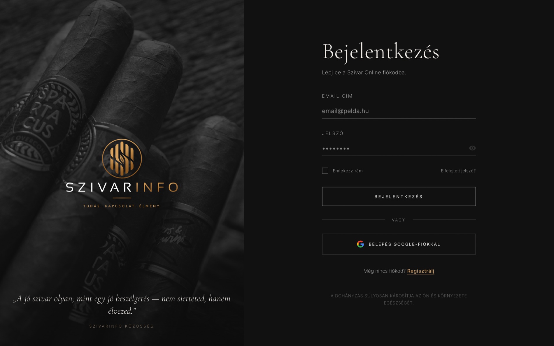
A split-screen login: a full-bleed, desaturated portrait beside a quiet obsidian form. Arrival, not admin.
A member's saved cigars, kept in the same de-boxed language as the catalog — a personal shelf inside the club.
Membership balance and perks, presented as a statement rather than a wallet — discreet, legible, unhurried.
A Real App
on the Phone
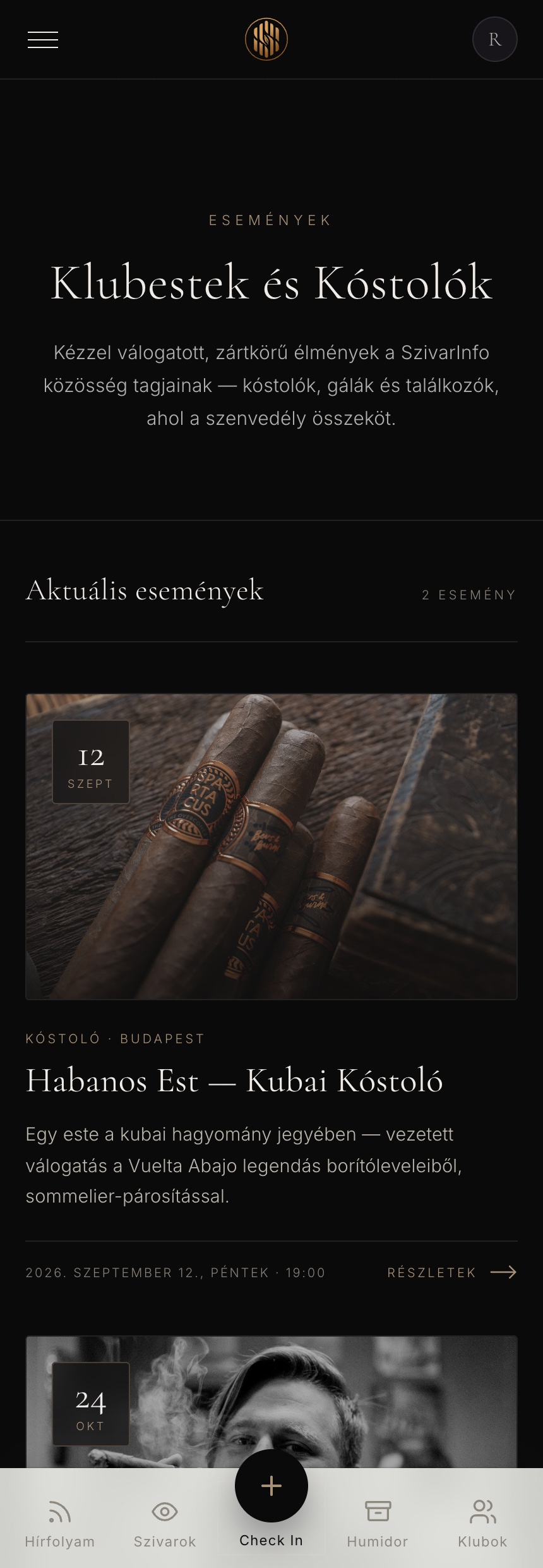
A cigar is enjoyed away from a desk, so the phone is the primary device. Below 992px the whole product becomes a native-feeling app shell — a frosted bottom-nav with an elevated Check-In, an adaptive glass header, and full-bleed content — not a squeezed website.
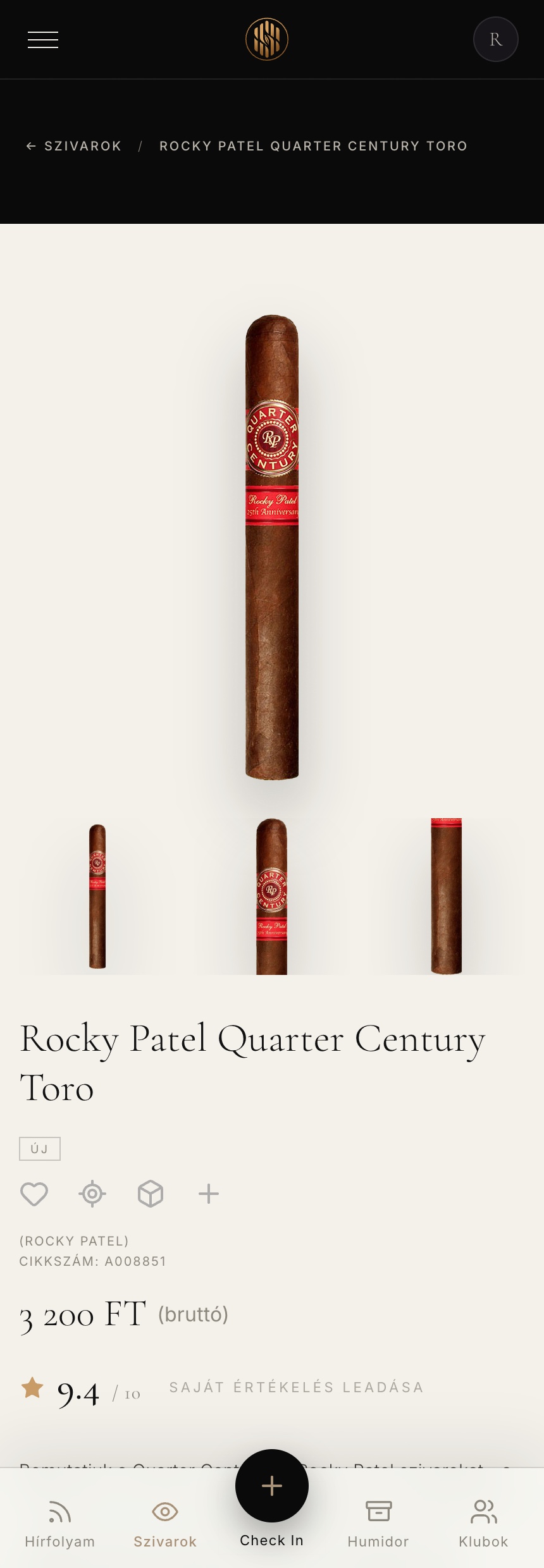
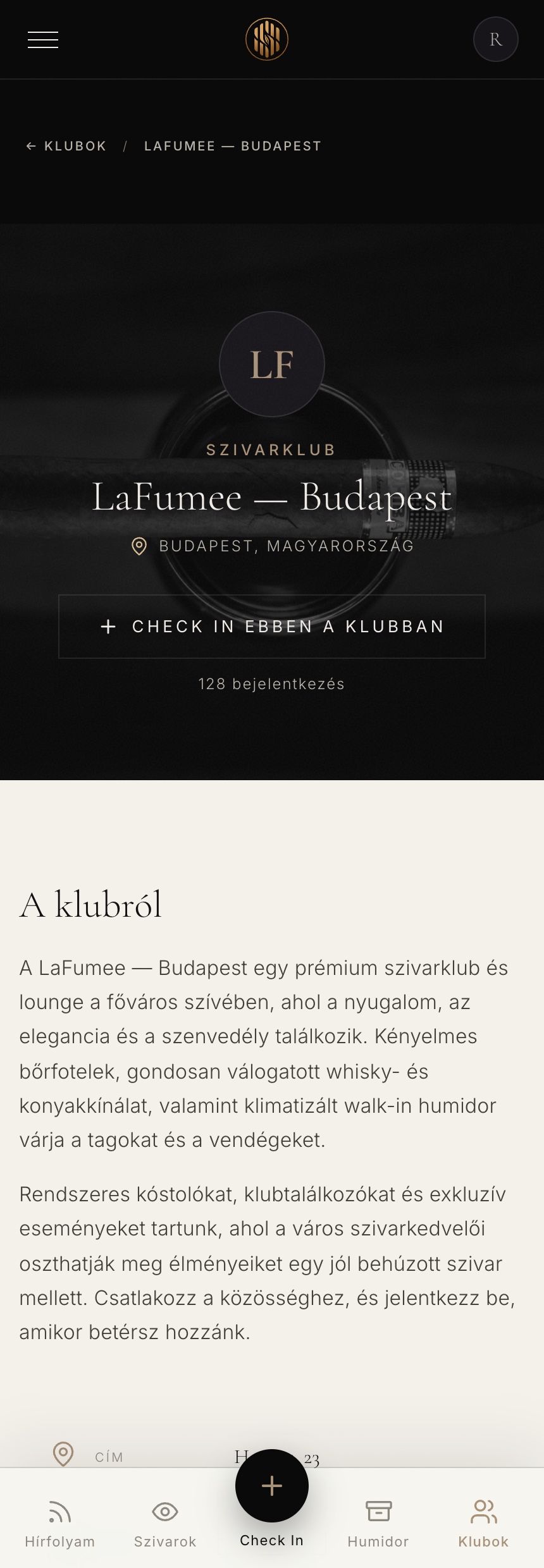
An app shell, not a page
A frosted glass bottom-nav carries the five everyday actions, with an elevated obsidian Check-In FAB breaking the bar — the interaction people expect from an installed app.
Adaptive glass header
The header senses the zone beneath it and flips between obsidian and ivory glass in real time, so it's always legible whether it's over a dark hero or an ivory grid.
Full-bleed, never boxed
Ivory zones run edge to edge on mobile instead of sitting in a centred card, keeping the colour-block language intact on the smallest screen.
The Layer Most
Case Studies Skip
Restraint only reads as luxury if the motion agrees. Everything moves on one slow, exponential easing — the pace of the ritual itself — and a handful of considered interactions do the work that decoration usually tries to.
0.3, 1
A single exponential ease-out governs every reveal, hover and header change — heavy and unhurried, so nothing feels like a snappy web widget.
Content rises and fades in on scroll, each item delayed a beat after the last, guiding the eye down the page in reading order.
Club and story imagery drifts on a slow scale on hover — cinematic movement that suits a place built for lingering.
The posh scroll
On scroll the header thins, the wordmark fades and collapses, and a glassmorphic blur settles in — a small choreography that makes the chrome feel bespoke.
Adaptive glass, both themes
An observer watches the zones behind the header and mobile bar and flips them between light and dark glass in real time — Apple-grade attention to legibility.
Hairline underline reveals
Links and tabs grow a 1px bronze underline from the centre on hover — the quietest possible affordance, in keeping with the whole system.
“Motion is the tell. If the animation is fast and bouncy, no palette in the world will make the product feel expensive.”
Discreet by
Design
This is a Hungarian-language, closed community for adults — and, pointedly, not a tobacco advertisement. That responsibility shaped the tone as much as the type: restrained, private, and built to be read by a wide age range.
Hungarian-first and invite-only from the login screen. The product is a private members' club, so it sells nothing publicly and shows no promotional pricing outside the gate — belonging, not advertising.
Every screen, label and empty state is authored in natural Hungarian for a domestic community — not translated English retrofitted to fit.
Invite-only by design: the experience is a closed club, keeping it clear of tobacco-advertising territory and out of reach of the underage.
An audience from 25 to 80 meant erring toward larger type, generous spacing and high-contrast ink on ivory rather than fashionable low-contrast greys.
On a phone-first product, every control clears a comfortable touch target — with catalog specs made always-visible on touch, where there is no hover.
Strength, wrapper and state are always carried by an icon or label as well as a hue, so meaning survives for colour-blind members.
No dark patterns, no urgency, no upsell. The tone matches the ritual — quiet, adult and unhurried from end to end.
From Web Tool
to Members' Club
The clearest way to judge the work is side by side: the same community, the same 1,823 cigars — a generic catalog app becomes a distinctive, editorial home worth being invited into.
A generic catalog tool
- White background, orange accent, bordered cards
- A specs table skimmed under every product
- No mark, no voice, no art direction
- Reads as e-commerce, not community
- Nothing that signals invite-only belonging
- Interchangeable with any online store
A quiet members' club
- Obsidian-and-ivory editorial colour-blocking
- Data typeset as an object to savour
- A crafted monogram identity and voice
- Reads as a private club, not a checkout
- Membership made tangible, from login to VIP card
- Distinctive — unmistakably its own brand
What the Work
Delivered
A single, coherent brand and a fully built, responsive front end across the whole community — identity, experience and 30-plus high-fidelity screens, all from one design system.
A Brand From Scratch
A new name, monogram and art direction gave an anonymous tool a distinctive identity — one that deliberately avoids every cliché of the category.
Built, Not Just Drawn
The redesign was delivered as a real, responsive front end — 30-plus coded screens with working filters, drawers, modals and an app shell, ready to wire to the platform.
One Language, End to End
From the login door to the VIP card, every screen speaks the same restrained system — the coherence that makes a small community feel like a real institution.
What I'd Carry Forward
Honest lessons from taking one product from a generic tool to a branded community — the things I'd take into the next brief.
The cliché map is a design tool
Naming everything we refused to do — up front, explicitly — was as useful as any moodboard. It turned "make it premium" into a set of concrete, testable rules.
Contrast beats darkness
The instinct for "premium cigar" is to go dark and gold. The stronger, less obvious answer was obsidian against ivory — restraint with tension, not just a dim room.
A hairline can replace a box
Removing every border forced better spacing and hierarchy. The de-box rule did more for the premium feel than any single visual flourish could.
Build to prove the feel
Coding the front end — real motion, real glass, real drawers — surfaced the "does it feel expensive" questions that static frames hide until it's too late.
Where It
Goes Next
The rebrand and build are the foundation. From here, the roadmap turns a beautiful shell into a living, data-backed community.
Wire to the platform
Connect the built front end to real member accounts, the live catalog and check-in data behind the invite gate.
A real taste graph
Turn ratings and check-ins into recommendations — "cigars members like you rate highly" — the payoff of the social data.
Installable PWA
Ship the app shell as an installable PWA with offline humidor access, so the collection is always to hand.
Measure & iterate
Instrument check-in frequency, catalog depth and club activity to prove engagement and steer the next release with data.
The community is real —
and it's online now.
SzivarInfo runs today as an invite-only platform for Hungary's premium cigar aficionados. Step through the door and see it for yourself.
Visit the live site →
The Ritual,
Made Social
Borrowing the proven loop from Untappd, a check-in lets a member log what they're smoking, where and with whom — feeding a community timeline that makes the platform feel alive rather than archival.
A calm, editorial timeline of check-ins, notes and club activity — the community's front page.
A single logged cigar: rating, location and notes, presented as a considered record, not a status update.