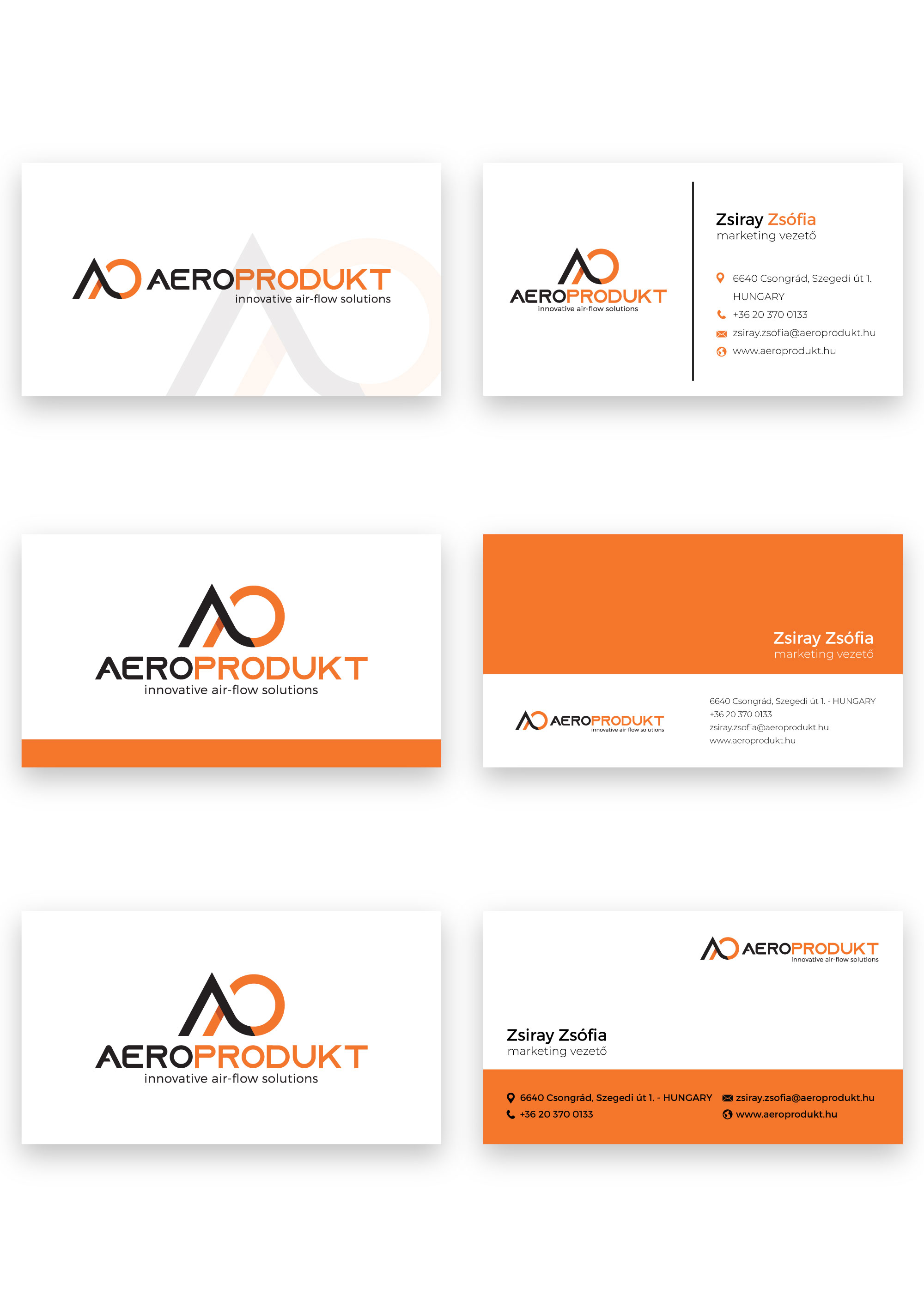
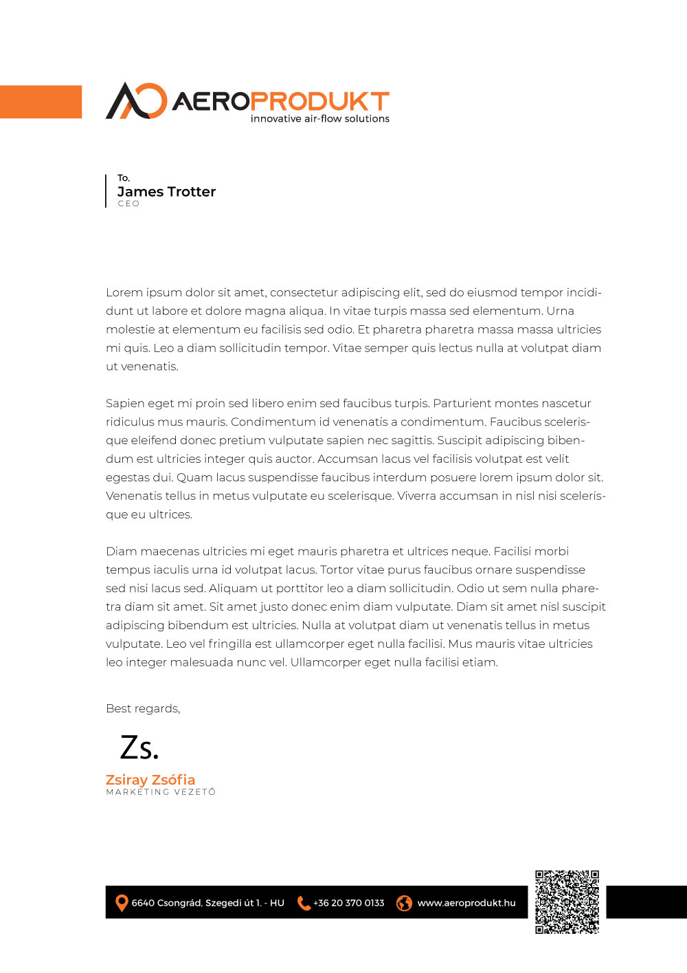
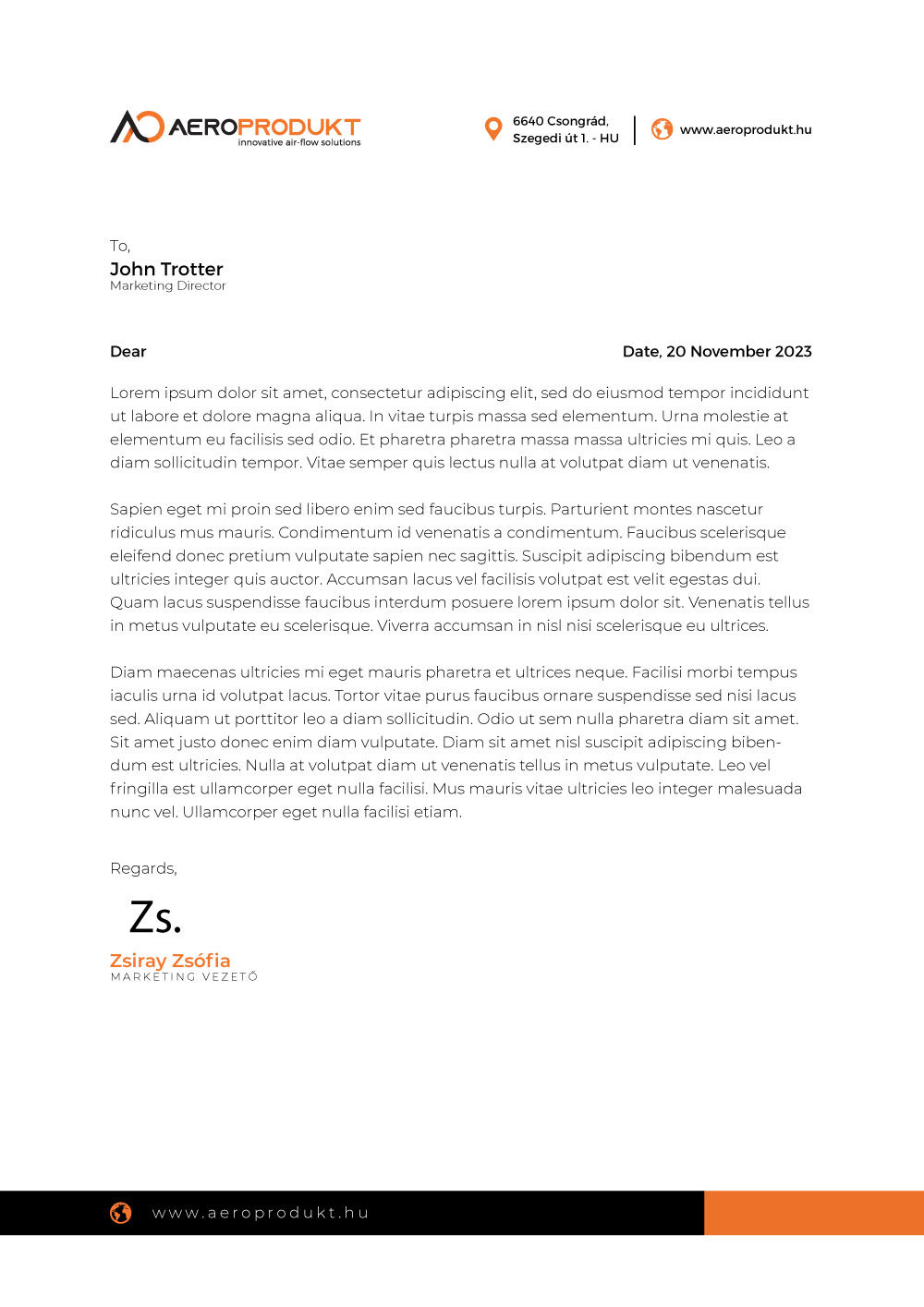
(Visual Identity — Logo, Colour, Typography & Stationery)
Aeroprodukt came to us with no visual identity in place — no logo, no defined colours, no typographic system. The brief was straightforward but demanding: create a complete, professional brand identity from the ground up, one that would communicate reliability, precision, and expertise across both print and digital.
The challenge wasn't just to design a logo. It was to make every subsequent application — business cards, letterhead, future collateral — feel like it came from the same deliberate visual system, not a collection of isolated decisions.
The Objective: Establish a cohesive visual identity system — including colour palette, typography, primary logo and its variants, and a corporate stationery suite — that positions Aeroprodukt as a credible, professional brand.
Colour and typography aren't cosmetic — they are the brand's voice before a single word is read. For Aeroprodukt, both needed to project confidence and professionalism without feeling cold or generic.
Colour — The palette was built around a strong primary colour chosen for its authority and legibility across different media. A carefully balanced supporting neutral ensures the identity remains versatile: it holds its weight on white stationery, scales to large-format print, and reproduces cleanly in CMYK production.
Typography — The typeface selection prioritised legibility at small sizes — essential for business cards and letterhead — while carrying enough character to feel considered. A clean, geometric sans-serif was chosen as the primary face, giving the brand a contemporary, precise personality suited to Aeroprodukt's field.
Both decisions were validated across all planned applications before the logo design phase began — ensuring the system would hold together as a whole, not just look good in isolation.
The Aeroprodukt logo was designed with real-world application in mind from day one. A single mark that works in isolation isn't enough — a professional brand identity needs to adapt to different formats, orientations, and contexts without losing coherence.
Portrait Variant (Álló) — The standing configuration stacks the mark above the wordmark, creating a compact unit that works well in square or near-square contexts: profile images, stamps, embossed stationery elements.
Horizontal Variant (Fekvő) — The landscape configuration places the mark alongside the wordmark, optimised for the most common real-world use cases — document headers, business cards, email signatures, and wide-format applications. This is the primary working variant of the logo.
Both variants were delivered in CMYK, production-ready for offset printing — the standard for any professional stationery suite.
A logo is only as strong as its application. The final phase of the project was translating the defined system — colour, typography, and logo — into the two most essential corporate touchpoints: the business card and the company letterhead.
Both were designed with the same discipline applied throughout: no decoration for its own sake, every element serving a functional and brand purpose. The result is a stationery suite that feels complete and considered — not designed piece by piece, but as part of the same whole.
Deliverables
Logo + Stationery
Client
Aeroprodukt
Category
Visual Identity
Format
CMYK Print
Have a project in mind? Let's talk.
Get In TouchOver the years I have worked for and cooperated with various companies from various industries.
Some of them can be found here:
Let's talk.
Unleashing brand potential through creative design and innovation.